
Think of your website like a piece of art that can resize itself. Whether someone's looking at it on a massive cinema screen or the tiny face of a smartwatch, the picture is always clear, perfectly framed, and easy to appreciate. That’s the magic of responsive web design. It's an approach that lets your website fluidly adapt to whatever device it's viewed on.
What Exactly Is Responsive Web Design?
At its core, responsive design is about creating a single, flexible website that delivers a great experience for everyone. It means no more frustrating pinching and zooming to read text or awkwardly panning across the screen just to find the menu. The layout simply re-organises itself for easy reading and navigation on any device.
This isn't just a technical trick; it's a direct response to how we all browse the web now. In Australia, an incredible 63% of all internet traffic comes from mobile devices. Whether you’re running a bustling online store or a local cafe, that statistic is a game-changer. If your website isn’t built for mobile, you're essentially invisible to the vast majority of your audience.
Why It’s No Longer Optional
Having a responsive website has moved from a "nice-to-have" feature to an absolute must. It’s a fundamental part of building a credible and effective online presence. It guarantees that every single visitor gets the best version of your site, no matter if they’re on a laptop, tablet, or phone. This consistency is vital for building trust.
A responsive design doesn't just make your site look good everywhere. It makes your site work everywhere, ensuring functionality, speed, and a frustration-free experience for every single user.
This focus on the user has a powerful ripple effect across your entire business:
- A Better User Experience (UX): When visitors can easily navigate and read your content, they’re far more likely to stick around and engage with your brand.
- Stronger SEO Performance: Google actively boosts mobile-friendly websites in its search results. A responsive site gives you an immediate leg up on the competition.
- Simpler Website Management: Instead of juggling separate desktop and mobile sites, you only have one to update and maintain. This saves a huge amount of time and money.
True responsiveness goes beyond just screen size, too. It’s about making sure your site works for everyone, including those with disabilities. Digging into web accessibility best practices for mobile devices is a crucial step to making your design truly inclusive.
The Three Pillars of Responsive Design
Responsive design isn't some single, magical piece of technology. It’s actually a clever combination of three core techniques working together. Once you understand these pillars, the "how" behind a website's seamless adaptation becomes much clearer. Think of them as the foundational rules that let your digital storefront look and work its best, no matter how someone is viewing it.
This simple diagram shows the concept in action: one central website design intelligently adapting to desktops, tablets, and phones.
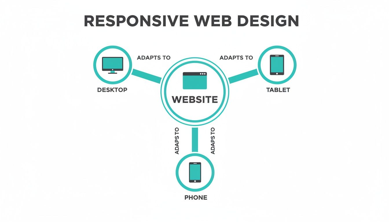
The real beauty here is efficiency. You build and manage one site, not three, which keeps your branding consistent and makes updates a whole lot simpler.
Pillar 1: Fluid Grids
The first pillar is the fluid grid. Picture your website's layout like a set of shelves. In an old-school, non-responsive design, those shelves are built from solid timber, cut to fixed centimetre widths. They are rigid and unmoving.
A fluid grid, on the other hand, uses percentages. It’s like building your shelves with elastic. As the wall they're on (the browser screen) gets wider, the shelves stretch to fill the space. When it narrows, they shrink down, all while keeping their relative spacing and proportions intact. This is what stops you from getting that weird, empty whitespace on a huge monitor or having content spill off the edge of a phone screen. It's the very骨架of a responsive site.
Pillar 2: Flexible Images
Next up, we have flexible images (and other media, like videos). We've all been there: you open a site on your phone, and a massive photo is awkwardly cut off, or it's been squished into a bizarre, distorted shape. That’s a non-flexible image at work.
Responsive images are much smarter. They're coded with a simple but powerful rule: never be wider than the container you're in. Going back to our analogy, the image can never be wider than the elastic shelf it's sitting on.
This instruction forces images to scale down gracefully on smaller screens, preventing them from breaking the layout. It’s also a huge win for performance, as you're not trying to cram an enormous desktop-sized image onto a tiny mobile screen, which helps your pages load faster.
Pillar 3: Media Queries
The final and most active pillar is media queries. Think of a media query as a traffic controller for your website's style. It's a bit of CSS code that checks the device's characteristics—most often, the width of the screen.
Based on what it finds, it applies a specific set of rules.
A media query is effectively asking questions like, "Is this screen less than 768 pixels wide?" If the answer is "yes," it then says, "Okay, stack the columns on top of each other, make the text bigger, and hide the main menu behind a 'hamburger' icon."
These conditional rules are the engine that drives the transformation, allowing one website to have several distinct layouts, each one perfectly optimised for a different viewing environment.
To help you see how these technical pieces fit together to solve real business problems, here’s a quick breakdown.
Core Components Of Responsive Web Design Explained
| Component | What It Does In Simple Terms | Why It Matters For Your Business |
|---|---|---|
| Fluid Grids | Uses percentages (%) instead of fixed pixels (px) for layout widths. | Ensures your site looks organised and professional on any screen, from a tiny phone to a huge desktop monitor, preventing awkward gaps or broken layouts. |
| Flexible Images | Tells images and videos to automatically resize to fit their container. | Stops images from distorting or overflowing on mobile devices, which improves visual appeal and user experience. Also helps with faster page load times. |
| Media Queries | Applies different CSS styles based on screen size, orientation, or resolution. | This is the "magic" that allows for major layout changes, like turning a multi-column desktop view into a single-column mobile view for easy scrolling. |
By weaving these three pillars together, developers create a single, intelligent website that reflows, resizes, and reorganises itself for every single visitor. It’s a strategic approach that anticipates how people will interact with your site, leading to a universally professional and user-friendly experience.
How Responsive Design Actually Drives Business Growth
Thinking of responsive design as just a technical box to tick is a common mistake. It’s not just about making your website look good on a phone; it's a fundamental driver for real, measurable business growth. The moment you connect responsive design to tangible outcomes—how people find you, what they think of your brand, and if they decide to buy—you start to see its true power.
Let's get straight to the biggest win: search engine visibility. For years now, Google has been operating on a mobile-first indexing basis. This just means it looks at the mobile version of your website first when deciding how to rank you. If your site is a mess on mobile—or worse, non-existent—your search rankings will take a serious hit, and potential customers simply won’t find you.
A properly responsive site ensures you're playing by Google's rules, giving you a massive head start in a crowded market.

Boosting Conversions and Keeping People Engaged
Once someone finds you and lands on your site, responsive design’s job is to make them want to stay. A smooth, intuitive user experience (UX) is everything when it comes to turning a casual visitor into a genuine lead or a paying customer. When someone can browse your services on their phone without the annoying pinch-and-zoom or fumbling to tap a tiny button, you've removed a major source of frustration.
This positive experience pays off in several key ways:
- Lower Bounce Rates: Visitors are far less likely to hit the 'back' button in the first few seconds if your site is easy to use.
- Increased Time on Site: A well-designed layout naturally encourages people to click around, explore other pages, and get to know your brand.
- Higher Conversion Rates: By creating a seamless journey from browsing to buying (or enquiring), you remove friction and make it easy for customers to say "yes".
A responsive website isn't just about fitting a screen; it's about fitting into your customer's life. It meets them where they are—on their phone during a commute, on a tablet on the sofa—with a consistently excellent experience.
This isn't just theory. The data shows that responsive design can deliver 11% higher conversion rates on average. Here in Australia, with our high mobile usage, more than half of small businesses see a direct increase in sales after launching a responsive site. Speed is also a huge factor. Pages that load in just one second convert up to five times better than those taking five seconds, which is crucial when 53% of mobile users will ditch a site that takes more than three seconds to load. You can see more compelling website statistics to understand the full impact.
Making Your Business More Efficient
Beyond the obvious customer benefits, responsive design also makes life easier for you behind the scenes. Maintaining a single website is dramatically more efficient and cost-effective than juggling separate desktop and mobile versions.
This unified approach brings some serious operational perks:
- Simplified Maintenance: Content updates, security patches, or design tweaks? You only have to do them once.
- Consistent Branding: Your brand’s look, feel, and messaging stay the same everywhere, which builds stronger brand recognition.
- Future-Proofing Your Asset: A single, flexible codebase is far easier to adapt when new phones, tablets, or even smart fridges with browsers hit the market.
By investing in one responsive site, you’re not just improving the customer experience; you’re saving precious time and money that can be put back into growing other parts of your business. This efficiency, combined with better SEO and higher conversions, is what makes responsive design a true cornerstone of modern digital strategy.
Responsive Versus Adaptive Design Explained
When you start digging into responsive design, you’ll inevitably run into its cousin: adaptive design. They both try to solve the same problem—making a website look great on any device—but they go about it in completely different ways. Getting your head around this difference is crucial to understanding why responsive has become the go-to standard for most of us.
Let's try a simple analogy. Responsive design is like a single, brilliant outfit made from a high-tech, stretchy fabric. It fits you perfectly whether you’re sitting, standing, or sprinting for the bus—it just fluidly adjusts to whatever you're doing. It’s one versatile design that works everywhere.
On the other hand, adaptive design is like having a wardrobe with a few different-sized outfits—a small, a medium, and a large. When someone visits your site, the server takes a quick look at their screen size and hands them the closest pre-built, fixed-width layout off the rack. It doesn't stretch; it just picks the best available fit.
Choosing the Right Approach
Now, adaptive design might seem appealing because it gives you precise control over the layout for specific devices. But that control comes with some serious baggage. Creating and maintaining a whole bunch of fixed layouts is far more complex, time-consuming, and expensive. It’s the difference between looking after one great outfit versus tailoring and updating a closet full of them.
This is where responsive design really shines, because it’s built for efficiency right from the get-go.
- Better for SEO: Google has made it pretty clear it prefers responsive design. Why? Because you’ve got one URL and one set of HTML code. This makes it a breeze for search engines to crawl, index, and organise your content, which is a huge plus for your search rankings.
- Lower Maintenance: This is a big one. With just one design to worry about, updates are so much simpler. You make a change in one place, and it rolls out across every single device. That’s a massive saving in time and headaches.
- Future-Proof Flexibility: Let's face it, new devices with weird and wonderful screen sizes pop up all the time. A fluid, responsive design will naturally adjust to these new gadgets without you having to lift a finger. An adaptive site? You’d be back at the drawing board, building a new fixed layout for every new popular device.
For most modern businesses, the choice is clear. Responsive design offers superior flexibility, better performance for SEO, and a more sustainable approach to website management, making it the strategic and cost-effective standard for reaching customers everywhere.
Common Responsive Design Pitfalls To Avoid
Building a responsive website isn't just about making things shrink. I’ve seen countless sites that get the basic resizing right but completely drop the ball on the details, leading to a clumsy experience that sends potential customers running. Knowing what these common tripwires are is the first step toward building a site that actually works for everyone, on any device.

One of the biggest culprits? Performance. A design can be visually stunning, but if it’s sluggish because of heavy, unoptimised images, mobile users on a patchy connection won't stick around. Slow load times are a certified conversion killer, and they can hurt your search engine rankings, too.
Another classic mistake is clunky navigation. That beautiful, expansive menu that looks so elegant on a 27-inch monitor often turns into an overwhelming, confusing labyrinth on a phone. Your visitors shouldn't have to play detective to find what they need. Navigation has to feel obvious and easy, no matter the screen size.
Overlooking The User Experience Details
Beyond the big issues like speed and menus, it's often the smaller, forgotten details that create a truly frustrating experience. These little oversights build up, leaving a bad taste in your visitors' mouths.
- Illegible Text: Type that's perfectly readable on a desktop can become squint-inducing on a mobile screen. Forcing people to pinch and zoom just to read your content is a surefire way to make them leave.
- Forgetting Touch Targets: We use our fingers on mobile, not pixel-perfect mouse cursors. Buttons, links, and form inputs need to be big enough—and have enough space around them—to be tapped easily without hitting the wrong thing.
- Ignoring Viewport Settings: Without the right viewport meta tag, a mobile browser might just show a shrunken-down version of your desktop site. The result is a tiny, unreadable page that's effectively useless.
A truly responsive site anticipates user needs. It considers not just what the user sees, but how they interact with the content—whether by clicking a mouse or tapping a finger.
Getting this stuff wrong isn't a minor annoyance; it’s a major business problem. In fact, a lack of responsive design is the number one reason Australian websites get a redesign. A whopping 53.8% of businesses cite it as the main driver—more than poor conversions or high bounce rates. This highlights just how costly a poor responsive implementation can be. You can dive deeper into these Australian web design statistics to see the full picture.
By steering clear of these common pitfalls, you move beyond a site that simply works on mobile to one that provides a genuinely seamless and enjoyable experience—one that builds trust and keeps people coming back.
How A Digital Agency Builds Your Responsive Site
Putting together a responsive website that genuinely works for your business is much more than just picking a nice-looking template. A professional digital agency follows a deliberate, strategic process to deliver real results, transforming your website from a simple online brochure into a serious tool for growth.
It all kicks off with a discovery phase. This is where the agency team really gets under the hood of your business—your goals, your brand, and most importantly, your audience. Who are you trying to reach? What are their pain points? Getting this right from the start shapes every single decision that follows.
Strategy Before Design
Once those objectives are crystal clear, we get into the strategy. This is where the mobile-first approach really shines. By planning for the smallest screen first, we're forced to focus on what truly matters, which results in a cleaner, faster, and more intuitive experience for the vast majority of your visitors.
This phase typically involves:
- User Experience (UX) Mapping: We carefully map out the ideal customer's path through your site, smoothing out any bumps or confusing steps along the way.
- Conversion Optimisation: Every single element, from the colour of a button to the wording on a call-to-action, is designed with one purpose: to guide users toward a specific goal.
- Performance Engineering: Speed and security are baked in from the very beginning. We know that a snappy, secure site has a massive impact on your SEO rankings and whether visitors stick around.
An agency’s real job isn’t just to build a pretty website. It’s to deliver a digital asset that becomes the core of your entire marketing effort, boosting the performance of every other channel and turning casual visitors into dedicated customers.
If you’re thinking about bringing in the experts, understanding the strategies for finding the right design agency is a critical first step. This partnership is what ensures you get a site that doesn’t just look good on any screen, but one that actively pushes your business forward.
Your Responsive Design Questions, Answered
Jumping into web design can feel a bit overwhelming, and it's natural to have questions. When business owners start looking into responsive design, a few key queries always seem to pop up. Here are some straight-up answers to the questions we hear most often.
How Much Does A Responsive Website Cost?
This is usually the first thing people ask, and the most honest answer is, "it depends." The final cost really hinges on the complexity of your site—things like the number of pages, any custom features you need, and how intricate the design is. A simple, elegant site with a few pages will naturally cost less than a sprawling e-commerce store with hundreds of products and complex integrations.
The key is to think of it as an investment, not just a cost. Building one responsive site means you don't have to create and manage a whole separate mobile version. That consolidation saves a significant amount of money and headaches over the years, making it the smarter financial choice for the long haul.
Can My Existing Website Be Made Responsive?
Often, yes. It's possible to retrofit an existing site by having a developer dig into the code and apply responsive principles like fluid grids and media queries. If your site is relatively new and built on a solid technical foundation, this can be a great path forward.
But for older sites running on dated technology, it can be a bit like trying to put a modern engine in a vintage car. Sometimes, it’s far more practical and cost-effective to build a new one from the ground up. A full redesign is a chance to improve everything at once—responsiveness, speed, security, and the overall user experience—setting you up for future success.
How Do I Check If My Website Is Responsive?
Good news: you don't need to be a developer to run a quick test. The simplest way is right in your web browser.
- Open your website on a desktop computer.
- Grab the corner of your browser window and slowly drag it to make it narrower.
- Pay attention to what happens on the page. Does the layout shift and re-organise? Do images shrink? Does text wrap neatly to fit the new space? If so, you’ve got a responsive site.
For a more official verdict, Google offers a free Mobile-Friendly Test tool. Just pop in your website’s URL, and it’ll tell you if your site meets Google’s mobile usability standards, which is a massive tick in the box for your SEO.
Ready to make sure your website looks and works beautifully on every single device? The team at Frank Digital Agency builds high-performance, conversion-focused responsive websites designed to drive real business growth. Learn more and get started today!