
When we talk about mobile phone web design, we're not just talking about making a desktop website look okay on a smaller screen. It's a completely different way of thinking. It's about building an online experience from the ground up, specifically for the device your customers are most likely using: their smartphone.
This means designing for thumbs, not mouse clicks. It means prioritising speed and simplicity to capture attention fast. In short, it’s a fundamental business strategy for turning mobile visitors into paying customers.
Why Mobile Design Is Your Greatest Growth Lever

Think of your website as your digital shopfront. For most of your potential customers, the first time they ever "walk in" is through their phone. If your site is slow, clunky, and hard to use, it's like having a jammed front door and messy aisles. People get frustrated and leave, and they probably won't be back.
This is exactly why a mobile-first mindset has gone from a nice-to-have to a non-negotiable. The idea is simple: design the experience for the smallest screen first, getting all the essentials perfect, and then scale it up for tablets and desktops. This forces you to focus on what truly matters, ensuring your core message and user journey are clear and effective for the vast majority of your audience.
The True Cost of a Poor Mobile Experience
A bad mobile experience does more than just annoy people. It actively hurts your bottom line and wastes your marketing budget. When a potential customer struggles to find your phone number, tap a button, or fill out a form on their mobile, they don't just give up. They often form a lasting negative opinion of your brand.
The stats tell a stark story. Here in Australia, over 60% of all website traffic now comes from mobile devices. Digging deeper, research shows that a staggering 57% of Aussie users will simply abandon a business with a poorly designed mobile site. That’s a direct line to lost leads and sales. You can read more about these Australian mobile usage stats to see just how critical this is.
This problem gets amplified when you're paying for traffic through channels like Google Ads. You’re paying good money for every single click. If that click sends someone to a landing page that's a nightmare to use on a phone, you're essentially just burning cash.
A great mobile website turns clicks into customers. A bad one turns your advertising budget into an expensive donation to Google.
Prioritising Mobile Is Prioritising Profit
At the end of the day, putting mobile phone web design at the top of your list is about future-proofing your business. It's a direct investment in generating more leads, building stronger customer trust, and getting a much better return on every dollar you spend on marketing.
By getting the mobile experience right, you're making sure your digital shopfront isn't just open for business—it's welcoming, efficient, and easy for everyone to use.
The Core Principles Of High-Converting Mobile Design
Your mobile website can be one of two things: a passive digital brochure or an active, lead-generating machine. The difference isn't magic; it comes down to a few core principles centred entirely on how real people actually behave. Great mobile design anticipates how users hold their phones, what they need to find in a hurry, and what will make them take that next step.
Think about it this way. A desktop user has the luxury of a big screen and a precise mouse cursor. A mobile user, on the other hand, is working with their thumb on a small screen, and they're probably distracted. Designing for that reality requires a focused approach that smoothly guides them from a casual visitor into a new customer.
Design For Thumbs, Not Cursors
This is the most fundamental rule of mobile user experience (UX): you have to design for thumb-friendliness. While desktop users can easily hover a cursor over tiny links, the thumb is the main navigation tool on a phone, and it's a lot less precise. If a button is too small or crammed next to another element, users will either miss it completely or hit the wrong one. That frustration is a one-way ticket to them leaving your site.
To get this right, we focus on creating generous touch targets. This simply means making buttons, links, and anything else you can tap large enough to be hit easily without needing to pinch-and-zoom.
- Button Size: Aim for a minimum touch target of 48×48 pixels. This gives the average thumb more than enough real estate to land an accurate tap.
- Spacing: Be generous with the space between tappable elements. This is your best defence against "fat finger" errors, where someone accidentally clicks an adjacent link.
- Placement: Put your most important buttons and navigation links within the "thumb zone"—that natural arc your thumb makes across the screen without having to awkwardly shift your grip.
This isn't just about looking good; it's a direct driver of conversions. When a user can effortlessly move through your site, their journey stays smooth and friction-free, making them far more likely to follow through on an action.
Create A Clear Visual Hierarchy
On a small screen, you can't show everything at once. This constraint makes visual hierarchy—the art of arranging elements to show their order of importance—absolutely critical. Your design needs to instantly answer a visitor's unspoken question: "What am I supposed to look at first?"
A strong visual hierarchy acts like a tour guide for the eye, pointing out the most important information in the right order. You can achieve this with a few classic techniques:
- Size and Scale: Bigger things grab more attention. It’s that simple. Your main headline should be significantly larger than your subheadings, and your primary call-to-action button should stand out from the rest.
- Colour and Contrast: Using a bold, contrasting colour for your "Get a Quote" or "Buy Now" button makes it pop off the screen, making it almost impossible to miss.
- White Space: Never underestimate the power of empty space. Giving an element some breathing room by surrounding it with white space makes it more prominent and easier for the user to focus on.
By establishing a clear path for the user's eye, you control the narrative. You ensure they see your value proposition, understand their options, and are drawn directly to the conversion point you've created for them.
Simplify Everything For Action
At the end of the day, a high-converting mobile design is a simple one. Every single element on the page needs to serve a clear purpose. If it doesn't help the user achieve their goal, it needs to go. This philosophy of simplification is most crucial in three key areas. To really tap into your site's potential, a solid foundation in mobile first design principles is essential.
- Simplified Navigation: Forget those sprawling, multi-level desktop menus. A mobile site thrives on a clean, stripped-back navigation structure, usually tucked away behind a "hamburger" icon (☰). This menu should only contain the absolute essentials—links to your most critical pages.
- Clear Calls-to-Action (CTAs): Your CTAs need to be direct and compelling. Use action-oriented text like "Call Us Now" or "Book Your Appointment" instead of wishy-washy phrases like "Learn More." Every page should have one clear, primary CTA that tells the user exactly what you want them to do next.
- Streamlined Forms: Nobody enjoys filling out long forms, especially on a phone. It's a major conversion killer. Keep your forms as short as humanly possible, asking only for the information you absolutely need. Use larger font sizes, enable auto-fill wherever you can, and use clear, simple labels for each field to make the process painless.
By focusing on these core tenets, you can transform your mobile website from a simple online presence into a powerful tool for business growth. For more details on the frameworks that make this possible, you might be interested in our guide on what responsive web design is and how it adapts to any screen.
Getting Into The Technical Side Of Mobile Performance
A beautiful mobile website that takes forever to load is like a high-performance sports car with no engine—it might look the part, but it’s completely useless for getting you where you need to go. Great mobile design goes much deeper than just the visuals; it’s all about what's under the hood. Understanding these technical details is critical because they are the difference between a visitor who stays and one who leaves in frustration.
To make sure a website works seamlessly on any device, from a tiny smartphone to a massive desktop monitor, designers mainly use two different methods: responsive and adaptive design.
Here’s a simple way to think about it. Responsive design is like a single t-shirt made from a super-stretchy material. It doesn't matter who puts it on; the fabric automatically stretches or shrinks to provide a perfect fit. In web terms, it’s one website code that fluidly rearranges itself to fit any screen size.
Adaptive design, on the other hand, is like having a wardrobe with the same shirt pre-made in small, medium, and large sizes. When someone visits your site, it detects their screen size and serves up the specific, pre-built layout that was made just for them. Both get the job done, but responsive design has become the go-to for most businesses because it's more efficient and easier to manage.
Responsive vs Adaptive Design At A Glance
So, which one is right for you? It really comes down to your audience, your budget, and how complex your website is. This quick comparison should help clear things up.
| Feature | Responsive Design | Adaptive Design |
|---|---|---|
| Flexibility | Highly flexible, fluidly adapts to any screen size. | Less flexible, uses fixed layouts for specific screen sizes. |
| Development | Simpler to develop and maintain with a single codebase. | More complex, requires creating multiple distinct layouts. |
| User Experience | Provides a consistent experience across all devices. | Can offer a more optimised, tailored experience for each device. |
| Best For | Most businesses, especially SMBs, blogs, and lead generation sites. | Large-scale, complex websites like major e-commerce platforms. |
While responsive is the most common choice for Adelaide small businesses, the end goal is always the same: deliver a fast, intuitive experience, no matter which technical path you take.
How To Supercharge Your Site Speed
Once you've got your design foundation sorted, it's time to focus on speed. We're talking about the little things that make a massive difference to how quickly your site loads. With 77% of all searches happening on mobile, a slow site isn't just an annoyance; it’s a deal-breaker.
Consider this: over 60% of web traffic is mobile, yet so many websites still miss the basics. A shocking 53% of users will abandon a site if it takes more than 2 seconds to load. That’s a massive chunk of potential customers gone in the blink of an eye. These numbers show that technical tune-ups aren't just "nice-to-haves"—they're essential.
Here are a few key performance boosters:
- Modern Image Formats: Forget about old-school JPEGs. Modern formats like WebP and AVIF can shrink your image file sizes dramatically without losing any visual quality. Smaller images mean a faster website, simple as that.
- Lazy Loading: This is a brilliantly simple trick. Instead of forcing a visitor’s browser to download every single image on a page right away, lazy loading only loads the images that are actually on the screen. As they scroll down, the next set of images appears just in time. It’s like a waiter bringing out your next course just as you finish the last one—it makes the whole experience feel smooth and efficient.
- Browser Caching: This tells a visitor's browser to "remember" key parts of your site, like your logo, fonts, and navigation menu. The next time they visit, the browser pulls up those saved files instantly instead of downloading them all over again. It’s a huge time-saver that makes return visits feel lightning-fast.
This decision tree shows just how quickly a poor user experience can kill a potential conversion on a mobile device.
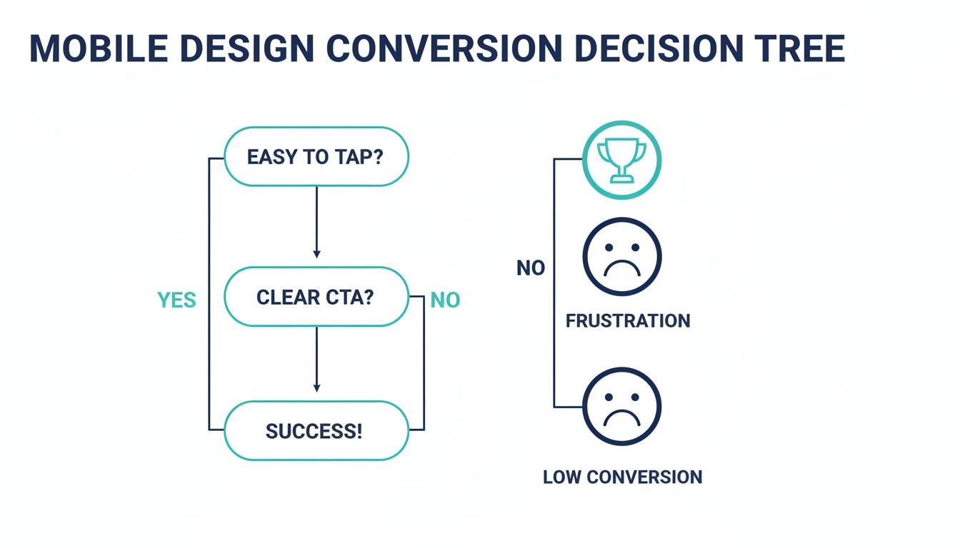
As you can see, if a user can't even easily tap a button, you've lost them right at the start. The journey to conversion is over before it even began.
A fast website isn’t just a technical achievement; it’s a powerful business asset. Every millisecond you shave off your load time is another chance to keep a potential customer engaged and guide them towards a conversion.
Putting these technical elements into practice is what separates an average mobile site from a great one. They all work together to create an experience that feels completely effortless for your visitors, which is exactly what you need to keep them engaged and moving towards your business goals. For a deeper look, it's worth understanding why https://frankdigital.agency/seo/website-speed-downright-necessary/. And when you're trying to iron out those tricky bugs on Apple devices, knowing how to use tools like the Safari browser console can be a real lifesaver.
How Mobile Design Impacts Your SEO and Ad Spend
Your mobile website is the engine room of your online visibility. It has a massive say in how customers find you and, crucially, how much you have to pay to get in front of them. Great mobile phone web design isn’t just a nice-to-have; it’s a non-negotiable factor that can make or break your most important marketing channels, from organic search (SEO) to paid ads on platforms like Google.
For years, we all thought of the desktop version as the "real" site, with the mobile version being a stripped-down afterthought. That thinking is now completely backwards. Google has flipped the script with a system called mobile-first indexing, and it's a game-changer for every single business with a website.
Google Sees Your Mobile Site First
Mobile-first indexing is actually pretty simple. It just means that when Google’s search bots crawl the web to understand and rank sites, they look at your mobile version first. That’s right—your mobile site is now what Google considers the primary, or "main," version.
So, if your mobile site is sluggish, missing important content that’s on your desktop site, or is just a pain to use, that’s the impression Google gets of your entire online presence. A clunky mobile experience sends a powerful negative signal, which can seriously damage your ability to rank for your most valuable keywords—even for people searching on a desktop.
In Google's eyes, your mobile website is your website. Any problems on the mobile version will drag down your overall SEO performance, making it much harder for potential customers to find you organically.
On the flip side, a slick, well-optimised mobile site is a huge SEO asset. It tells Google you’re providing a quality experience for users, which is exactly what they want to reward with higher search rankings. This is a vital concept to understand when planning your website design for SEO.
How a Bad Mobile Site Burns Through Your Ad Budget
The damage from poor mobile design is even more immediate—and expensive—when you're running paid ads. If you’re paying for Google Ads, every single click costs you money. If that click sends someone to a landing page that’s frustrating to use on a phone, you're basically setting your cash on fire.
This happens for two main reasons:
- Your Conversion Rates Plummet: Someone who lands on a confusing mobile page simply won't convert. They’re not going to pinch and zoom to fill out a tiny form or hunt for your phone number. They’ll just hit the back button and click on your competitor’s ad instead.
- It Wrecks Your Quality Score: Google Ads uses a metric called Quality Score to judge how relevant your ads, keywords, and landing pages are. A massive piece of that puzzle is the "landing page experience."
If your landing page is slow, clunky, or just not built for mobile, Google will give you a poor Quality Score.
The Financial Hit of a Low Quality Score
A low Quality Score isn't just a bad report card; it's a direct financial penalty. It forces you to pay more for each click (a higher Cost Per Click, or CPC) just to hold the same ad position as a competitor with a better mobile page. In contrast, a great mobile experience earns you a higher score, which Google rewards with a lower CPC and better ad placements.
Let's put this into a real-world Adelaide scenario:
- Scenario A (Poor Mobile Design): An emergency plumber in Adelaide runs an ad. A potential customer clicks it from their phone, but the landing page has a tiny, un-clickable phone number. Frustrated, they leave. The plumber just paid for a click that generated zero business, and their low Quality Score is making every future click more expensive.
- Scenario B (Great Mobile Design): The same person clicks a competitor's ad. This time, they land on a page with a big, obvious "Call Now" button right at the top. One tap, and they're connected. The plumber gets a new job, and that positive user experience helps improve their Quality Score, making their ads cheaper over time.
At the end of the day, a fantastic mobile experience ensures that the traffic you’re paying for has the best possible chance of becoming a real lead or sale. It turns your ad spend from a necessary expense into a truly profitable investment.
Your Practical Mobile Web Design Audit Checklist

It’s time to stop guessing and start measuring. This practical checklist is designed so you can put your own website to the test, right now, with nothing but your smartphone. Think of it as a quick self-diagnostic.
The goal here isn't just to see if your site "works" on a phone. It's to uncover the specific friction points that are quietly costing you leads and sales. Use these questions to find real weaknesses and see exactly how a professional redesign focused on mobile phone web design can deliver tangible results.
So, grab your phone, pull up your website, and let’s dive in.
The First Impression Test
How does your site hold up in those first few critical seconds? A user's initial experience sets the tone for their entire visit, and a slow, clunky start is often an instant deal-breaker.
Does it load in under 3 seconds on a mobile connection? Be honest. If you have to wait, your potential customers are already getting impatient. Research shows bounce rates go through the roof after the three-second mark.
Is the text instantly readable without pinching to zoom? If someone has to manually resize your content just to read it, you've already failed a basic mobile usability test.
Are the most important things visible without scrolling? We call this "above the fold." A visitor should immediately see who you are, what you do, and a clear next step (like a phone number or a button).
User Experience and Navigation Audit
Okay, now let's actually try to use the site. This part is all about how intuitive it feels. A great mobile site should be effortless, guiding people to what they need without any real thought or frustration.
- Can you easily tap every menu item with your thumb? Buttons and links need to be big enough and have enough space around them to avoid those frustrating "fat finger" mistakes. You should be aiming for a touch target of at least 48×48 pixels.
- Is the main navigation simple and logical? A mobile menu shouldn't be a novel. It needs to be stripped back to only the most critical pages a customer would be looking for.
- Do all the images load correctly and fit the screen? Images that are too big, distorted, or broken just make your business look sloppy and, worse, they slow your site to a crawl.
- Can you easily get back to the homepage from any page? Your logo should always be a clickable link that takes the user home. It's a standard web convention that everyone expects.
A mobile website should feel like a well-designed app: intuitive, responsive, and built for the task at hand. If it feels like a shrunken-down desktop site, it’s not doing its job.
Conversion Readiness Check
This is where the rubber meets the road. A mobile site's real job is to turn visitors into customers. This final check zeroes in on the specific elements that drive action and generate business for you.
Answering "no" to any of these questions means you are almost certainly leaving money on the table.
Can you tap the phone number to start a call? For any service business, this is non-negotiable. Forcing someone to copy and paste a number is a massive conversion killer.
Are your forms simple and easy to fill out? Actually try filling out your contact form. Does it use the right mobile keyboards (like a number pad for the phone field)? Is it short, asking only for what's truly essential?
Is your main Call-to-Action (CTA) obvious on every page? Whether it’s "Get a Quote," "Book Now," or "Shop Online," the one thing you want a user to do should be impossible to miss. It needs to be a bold, contrasting button that grabs the eye.
Is your physical address linked to open in a map app? For local Adelaide businesses with a storefront or office, this is a must. A single tap should give customers directions right to your door.
This simple checklist gives you a clear snapshot of where your mobile site stands today. Now that you've found the weak spots, you can see exactly where a better mobile phone web design will have the biggest impact on your bottom line.
Essential Mobile Design Audit Checklist
Ready to get a bit more formal? Use this table to quickly run through the key points and see where your website passes and where it needs work. It's a great way to visualise the health of your site's mobile experience.
| Category | Checklist Item | Pass / Fail |
|---|---|---|
| Performance | Loads in under 3 seconds on a mobile data connection. | |
| Readability | Text is legible without needing to pinch-and-zoom. | |
| Above the Fold | Core value proposition and a primary CTA are visible on load. | |
| Navigation | Menu is simple, uncluttered, and easy to use with a thumb. | |
| Touch Targets | All buttons and links are at least 48×48 pixels and have adequate spacing. | |
| Images | Images are optimised, load quickly, and display correctly on the screen. | |
| Forms | Forms are short, use mobile-friendly input types, and are easy to complete. | |
| Click-to-Call | Phone numbers are tappable links that initiate a call. | |
| Click-to-Map | Physical address is a tappable link that opens a map application. | |
| CTA Visibility | A clear and compelling Call-to-Action is present and prominent on every key page. |
By the end of this audit, you should have a much clearer picture of your mobile strengths and weaknesses. Each "Fail" is simply an opportunity to create a smoother, more profitable experience for your customers.
Your Mobile Web Design Questions, Answered
Deciding to invest in your website naturally brings up a few questions. We get it. Below, I’ve answered some of the most common queries Adelaide business owners have when they're thinking about mobile phone web design. My goal is to give you straight, clear answers so you can move forward with confidence.
We'll tackle everything from costs and timelines to whether those DIY builders are really worth it.
How Much Does A Professional Mobile-Friendly Website Cost?
For a small to medium-sized business in Adelaide, a professionally built, mobile-first website typically falls in the $5,000 to $15,000 range. This isn't just for a pretty design; it’s for a custom-built strategy tailored to your specific business goals.
That price ensures every element is engineered from the ground up to turn the people visiting on their phones into actual paying customers.
It’s helpful to think of it not as a cost, but as an investment in your most important business growth tool. A high-performing mobile website pays for itself surprisingly quickly by snagging leads and sales that would otherwise go straight to your competitors.
How Long Does It Take To Build A Mobile-Optimised Website?
From our first chat to launch day, a typical mobile-optimised website project takes between 6 to 12 weeks. This isn't an arbitrary timeline; it allows for a proper, detailed process. We need that time for in-depth design, careful development, and thorough testing on all the different devices and browsers people use.
We stick to a clear process with open communication, so your powerful new digital asset gets delivered on schedule. The aim is to get your site live and generating a return for you as soon as possible, without cutting corners.
Are DIY Website Builders Good Enough For Business?
Look, DIY builders like Squarespace or Wix can be tempting because the upfront cost is low. The problem is, they often create major headaches down the road for a business that's serious about growth. These platforms are notorious for slow performance, messy code that hurts your SEO, and design constraints that stop you from creating a truly effective user journey.
A professional agency, on the other hand, builds a performance-driven site just for you. It's fast, secure, and structured from day one to convert traffic from Google and your ads into real revenue.
Think of it like this: a DIY builder is like a flat-pack kit home. It does the job, sort of. A professional agency is like an architect designing and building a custom home just for your family. The custom build delivers far more value and performance in the long run.
Why Is Page Speed So Important For Mobile Sites?
Because mobile users have zero patience. It's a fact of life. More than 53% of mobile visitors will leave a page if it takes longer than three seconds to load. So, speed isn't just a nice-to-have feature—it’s the absolute foundation of a good mobile experience. A slow site is a leaky bucket for your leads.
On top of that, Google uses page speed as a major ranking signal. A faster website doesn't just keep visitors happy; it literally helps you rank higher in search results. That makes it easier for new customers to find you in the first place, which is a cornerstone of any decent mobile web design strategy.
Will My Old Website Work On Mobile Devices?
Your old site might technically load on a phone, but that doesn't mean it "works." So many older websites aren't responsive, forcing people to pinch and zoom just to read the text or try to tap on impossibly tiny links. It's a frustrating experience that sends potential customers running for the hills.
A modern, mobile-first design makes sure your site is a breeze to use on any screen. This approach guarantees that every single visitor, no matter their device, gets a smooth, intuitive experience that actually helps them become a customer and reflects well on your brand.
Ready to turn your mobile presence into your most powerful growth tool? The team at Frank Digital Agency specialises in building high-performance, mobile-first websites that turn clicks into customers. Get in touch today for a free consultation and let's discuss how we can grow your business.