
At their core, user experience design principles are the proven guidelines that help us create digital experiences people actually enjoy using. Think of them less as rigid rules and more as the fundamentals of good hospitality for your website. They ensure that when a visitor arrives, their journey is straightforward, efficient, and maybe even a little delightful.
Why User Experience Design Principles Matter
Picture walking into a poorly designed physical store. The aisles are a maze, products are all over the place, and finding the checkout feels like an impossible quest. You'd probably turn around and leave, right? Your website is exactly the same—it's your digital front door. User experience (UX) design principles are what tidy up the aisles and put up clear signs, turning a potentially frustrating visit into a smooth, positive one.
This is about so much more than just a slick visual design. Great UX comes from truly understanding how people think and what they need, then building a website that guides them effortlessly toward their goal. Whether they’re trying to buy something, book a service, or simply find an answer, the process should feel completely natural. They shouldn't have to stop and think, "Now what?"
The Foundation of a Successful Website
Good UX is built on a handful of powerful ideas that directly shape how a potential customer sees your business. It's often the invisible force that separates a website where visitors leave in five seconds from one that builds trust and earns loyal customers. The whole point is to eliminate friction and make people feel confident with every click.
When you apply solid UX principles, you're aiming to:
- Improve Usability: Make your site incredibly easy to figure out and navigate.
- Increase Credibility: Build trust with a professional, clear, and reliable design.
- Create Enjoyment: Ensure the interaction leaves a lasting positive impression.
This simple diagram breaks down the pillars of a great user experience: making every step intuitive, efficient, and enjoyable.
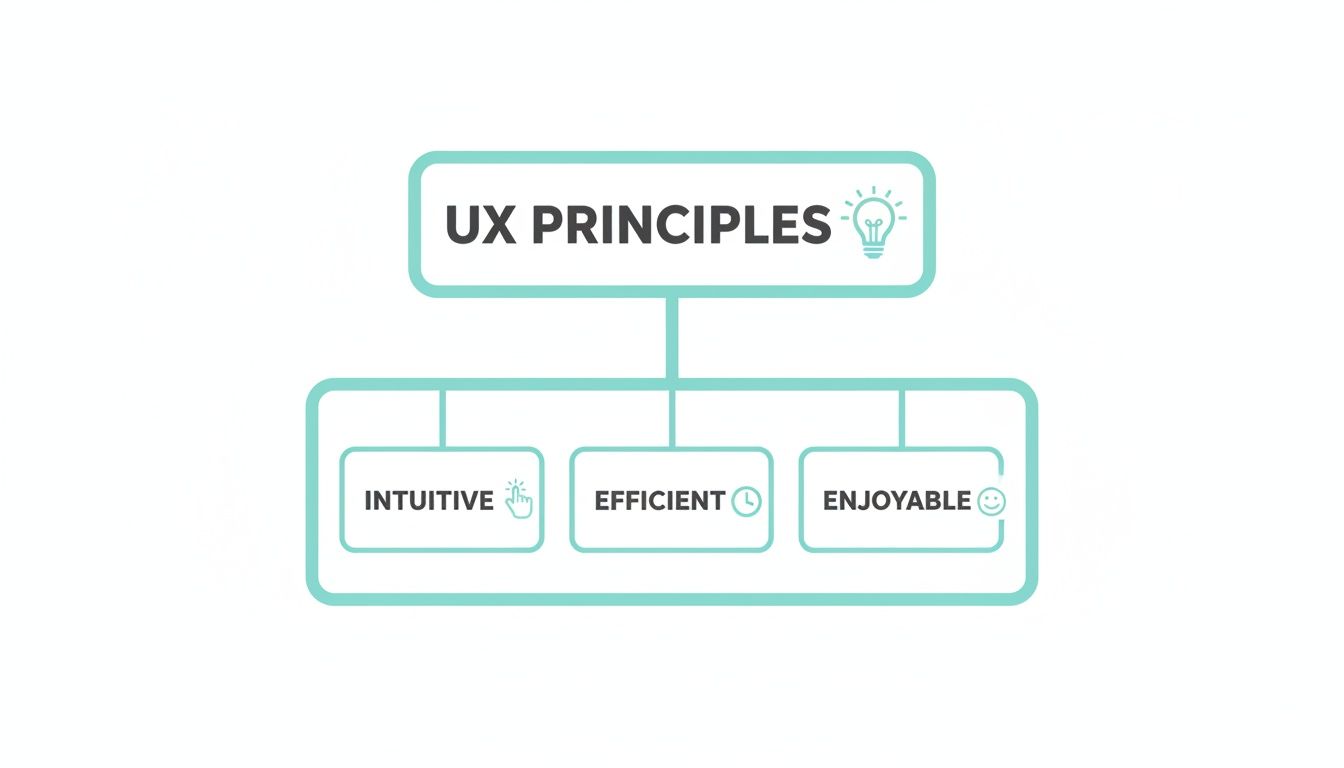
It’s clear that a powerful user experience is about more than just bare-bones functionality; it’s about the feeling it creates. To get a better handle on the big picture, it’s worth exploring what is user experience design in more detail.
When a user's journey is intuitive, they can achieve their goals without thinking. This effortless interaction is the hallmark of excellent UX design and the key to turning casual browsers into committed customers.
Ultimately, these principles all come back to one thing: empathy. When you put yourself in your customer’s shoes, you start to anticipate their needs and can design an experience that genuinely helps them. We dive deeper into this customer-centric mindset in our guide on what is user experience design. This approach is what elevates a website from a simple online brochure to a powerful engine for business growth.
The Power of Mobile-First Design
Where do your customers spend most of their time online? It’s not on a big desktop computer anymore; it’s on the phone in their pocket. That’s why treating your website's mobile version as a shrunken-down afterthought is a surefire way to lose business.
Adopting a mobile-first design philosophy isn't just a trendy term. It's a complete strategic pivot that forces you to build the user experience for the smallest screen first, not last. This means crafting an experience that’s genuinely built for the thumb-scrolling, on-the-go user who wants answers now, with zero fuss.

This shift is especially critical here in Australia. Recent research shows that 50% of young Aussies were using five or more devices to access the internet in 2023—a huge jump from just 30% back in 2020. And which device leads the pack? The mobile phone, of course.
The numbers don't lie: data also shows that 74% of visitors are more likely to come back to a website if it works beautifully on mobile. That’s a direct link between user experience and customer loyalty.
Why a Mobile-First Mindset Matters
Here’s the thing about designing for a small screen: it forces you to be ruthless with your priorities. There’s no room for clutter. You have to focus on what really, truly matters to the user, stripping away anything that gets in their way.
This kind of disciplined thinking often results in a cleaner, more intuitive design that, funnily enough, works better for everyone, even those visiting on a desktop.
Think about the real-world context. Someone might be searching for a local plumber while staring at a leaking pipe, or quickly trying to compare two products while standing in a competitor's store. They need speed and simplicity. A clunky mobile experience is more than just an annoyance; it's a direct hit to your leads, conversions, and bottom line.
For a mobile user, every extra second of load time and every unnecessary tap is a reason to leave. The difference between a captured lead and a lost opportunity is often decided by how quickly and easily they can achieve their goal on their phone.
Practical Applications for Your Business
So, how does this play out in the real world for Australian businesses? Let’s look at a couple of common examples.
For a Tradesperson (e.g., an Adelaide Plumber):
Imagine a potential customer with a burst pipe. They’re stressed. They grab their phone and search "emergency plumber Adelaide." Your site has seconds to make an impact.
- Priority 1: Click-to-Call Button: Your phone number needs to be a big, obvious, tappable button right at the top. In a crisis, no one is copying and pasting a number.
- Priority 2: Service Area: They need to know instantly if you serve their suburb. Make it crystal clear.
- Priority 3: Simple Service List: Use bullet points for key services like Blocked Drains, Hot Water Systems, or Emergency Repairs so they can see you handle their exact problem.
For an E-commerce Store:
Someone sees your product on Instagram and clicks the link on their phone. That journey from casual interest to a completed purchase has to be completely seamless.
- Large, Clear Product Images: Let them see the details without having to pinch and zoom awkwardly.
- Thumb-Friendly Buttons: "Add to Cart" and "Checkout" buttons need to be large and placed where a thumb can easily tap them.
- Simplified Checkout: Ditch the unnecessary form fields. Offer guest checkout and one-tap payment options like Apple Pay or Google Pay to make buying effortless.
In both of these scenarios, a slow-loading page or confusing navigation means a lost customer. By focusing on the mobile journey first, you meet your users where they are and give them exactly what they need. Learning how to build a website optimisation mobile-friendly site is no longer optional—it's essential for winning those crucial leads and sales.
Creating Landing Pages That Actually Convert
A landing page isn’t just another page on your website. It’s a specialist tool, laser-focused on one single job: turning a visitor into a customer or a lead. Whether someone arrives from a paid ad or an email promo, every single element on that page must work in concert to achieve that one specific goal. This is where putting core user experience design principles into practice becomes a game-changer.
Think of your landing page as a short, sharp conversation with a potential customer. It needs to grab their attention in seconds, get a compelling point across, and make it incredibly easy for them to take the next step. If there's even a hint of confusion, clutter, or friction, they’re gone. And so is your potential sale.
Guiding the User with Visual Hierarchy
The first rule of a landing page that converts is to establish a rock-solid visual hierarchy. This is simply the art of arranging everything on the page to show its importance, steering the user's eye exactly where you want it to land. Your headline—the most important message—has to be the first and most obvious thing they see.
From there, their gaze should naturally flow down to the supporting info and, crucially, to your call-to-action (CTA) button. This isn't just about aesthetics; it's about strategically controlling the user's journey. You can pull this off with a few clever design choices:
- Size: Make your headline and CTA button noticeably larger than anything else.
- Colour: Use a bold, contrasting colour for your CTA so it’s impossible to miss.
- Whitespace: Give your key elements breathing room. Empty space around them acts like a spotlight.
Without a clear hierarchy, a visitor's eyes will just wander around, and your core message gets completely lost in the noise.
Reducing Cognitive Load for Easy Decisions
Another vital principle is reducing cognitive load. In plain English, this just means making it as easy as possible for someone to process information and make a decision. A landing page packed with too many options, mixed messages, or a complex form creates mental friction, which often leads to decision paralysis.
The best landing pages remove every possible distraction. By stripping away navigation menus, footer links, and anything else that doesn't serve the primary goal, you create a focused environment where the only logical next step is to convert.
To apply this, keep your copy tight and your layout clean. Use bullet points to make text scannable and make sure your form only asks for the bare essentials. The less a user has to think, the more likely they are to act. The design's job is to make your desired action feel like the most obvious, simplest choice on the table. It's no surprise that conversion rates and good web design are so tightly linked.
Crafting a Compelling Call to Action
Your CTA is the most important element on the page, period. It’s the final instruction telling the user what to do. Weak, generic CTAs like "Submit" or "Click Here" are a massive missed opportunity. A truly compelling CTA must be:
- Action-Oriented: Kick it off with a strong verb that highlights the value. Think "Get Your Free Quote," "Download the Guide," or "Book a Consultation."
- Highly Visible: It needs to stand out from everything else through colour, size, and smart placement. It should be the star of the show.
- Singular: Have one primary CTA. Giving people too many choices just creates confusion and sinks your conversion rate.
Finally, build trust right where it matters most—next to the CTA. Weaving in social proof like customer testimonials, star ratings, or industry certifications can give a hesitant user the final nudge they need. These elements show that other people have trusted you and had a great experience, making it a much safer decision for them, too.
Right, let's get practical. Knowing the theory behind user experience is one thing, but making it work for your business is where the magic happens. This is the point where abstract ideas become real-world results—more quote requests, fewer abandoned shopping carts, and a healthier stream of qualified leads.
The goal isn't just a website facelift. It's about making deliberate, strategic changes that directly boost your bottom line. Let's break down exactly how you can apply these principles, whether you're a tradie, an e-commerce store, or a professional services firm.
For Local Service and Trade Businesses
Picture this: you're a plumber in Adelaide. Your ideal customer is probably standing in a puddle, phone in hand, and completely stressed out. A pipe has burst, the drain is blocked, or the hot water is gone. They don't have time to admire your website's design; they need a solution, now.
In this scenario, principles like clarity and efficiency are everything. Your website has one job: make it ridiculously easy for a desperate customer to call you.
- A Big, Obvious Call Button: The second your site loads on a mobile, a large, tappable phone number needs to be front and centre. Don't make someone in a panic hunt for it. This simple use of visual hierarchy is the fastest way to turn a visitor into a lead.
- Show Your Service Area: People need to know instantly if you can help them. Clearly stating "Servicing all Adelaide metro areas" or listing key suburbs removes any doubt and stops them from bouncing off your site.
- Keep Forms Short and Sweet: If you have a 'Request a Quote' form, strip it back to the absolute essentials. Name, phone number, and a quick note about the problem is all you really need. Every extra field you add is just another reason for them to give up and call someone else.
By dialling in on these key elements, you remove all the friction from their journey. You guide them straight from a stressful problem to the quickest possible solution—getting you on the phone.
For E-commerce Stores
For any online store, the final checkout is the make-or-break moment. You've already done the hard yards getting someone to your site and convincing them to add a product to their cart. Now, it's all about predictability to stop them from getting cold feet and abandoning the purchase.
Customers have a built-in expectation of how an online checkout should work. It needs to feel simple, secure, and familiar. Any unexpected hurdles or confusing steps can shatter their trust and send them packing.
Think of a smooth, predictable checkout as a digital handshake. It reassures the customer that their purchase is safe and in good hands. When each step feels logical and expected, you build the confidence they need to click "buy now."
Here’s how to nail this:
- Show Their Progress: Use a simple progress bar (e.g., Step 1: Shipping, Step 2: Payment) to show customers exactly where they are in the process. This manages expectations and makes the whole thing feel less like a chore.
- Offer Guest Checkout: Forcing someone to create an account is one of the biggest conversion killers out there. A guest checkout option respects their time and dramatically reduces friction.
- Provide Familiar Payment Options: Make sure you include trusted payment gateways like Afterpay, PayPal, Apple Pay, and Google Pay. Seeing logos they already know and trust instantly boosts their sense of security and convenience.
Each of these steps works together to make the final part of their journey feel safe and predictable, building the trust needed to complete the sale.
For Professional Services Firms
If you're a law firm, an accountant, or a conveyancer, you're not just selling a service—you're selling expertise and trust. When a potential client lands on your website, they're looking for proof that you're credible and professional. Here, the core user experience principles are consistency and findability.
Your website's structure needs to make finding information effortless, reinforcing your authority with every single click.
- Make Navigation Intuitive: Your main menu should use clear, simple labels like "Our Services," "About Us," and "Contact." Avoid internal jargon. A user should be able to guess exactly what they’ll find before they even click.
- Maintain Consistent Branding: Your logo, colour palette, and tone of voice must be the same on every single page. This creates a cohesive, professional experience that builds brand recognition and, most importantly, trust.
- Put Your Credentials on Display: Don't hide your testimonials, case studies, or team member profiles. Making this social proof easy to find is crucial for building credibility and turning a curious browser into a qualified lead.
The demand for this kind of expertise is booming. In fact, a report from mid-2022 noted that nearly 1,500 UX design roles were listed on Seek.com.au, which shows just how seriously Australian businesses are taking user experience. You can find more insights on the growing demand for UX design in Australia and see how it’s directly tied to business growth.
Using Personalisation to Elevate User Experience
Once you’ve got the fundamentals of a clear, mobile-first design sorted, the next level is making the experience feel personal. Think of basic UX principles as the solid foundation of a house. **Personalisation** is what turns that house into a home, making a user feel truly seen and understood.
It’s the digital equivalent of your local barista remembering your name and your usual coffee order. It’s that small touch that makes a big difference.
We're talking about using data to tailor your website’s content, layout, and flow to individual users. This is how you move beyond a generic, one-size-fits-all approach and create interactions that feel uniquely relevant. When you get this right, visitors feel a much stronger connection to your brand, which almost always leads to better engagement and loyalty.
From Data to Dynamic Experiences
Personalisation sounds complex, but it often starts with simple data points. Every click, search, and page view tells a story about who your visitors are and what they’re looking for. By paying attention to their behaviour, you can start to anticipate their needs and adjust their experience on the fly.
For example, you could use data to:
- Welcome Back Returning Visitors: A simple "Welcome back!" message or a showcase of new products related to their past purchases can go a long way. It’s a small nod that acknowledges their loyalty.
- Tailor Product Recommendations: An e-commerce store can suggest items based on a user’s browsing history, turning a generic product grid into a personally curated shopfront.
- Customise On-Site Content: A plumbing company could show testimonials from homeowners to residential visitors, while displaying case studies from commercial projects to business clients.
A personalised user journey transforms a website from a static brochure into a dynamic conversation. By adapting to the user's needs in real time, you show that you're not just selling a product or service—you're providing a solution built just for them.
This approach is a huge factor in Australia's e-commerce market, which is projected to hit US$37.10bn in 2024 and grow to an incredible US$58.03bn by 2029. As more Aussies shop online, AI-driven recommendations are becoming essential for boosting return visits, tapping into the 74% loyalty that comes from a great mobile UX. You can dive deeper into Australia's booming digital market on UX Spot.
Continuous Optimisation Through Testing
A great user experience isn't a "set and forget" project. It’s an ongoing cycle of improvement, driven by real user data—not guesswork. This is where A/B testing is your best friend.
A/B testing, or split testing, is a straightforward method for comparing two versions of a webpage to see which one performs better.
You simply show one version (the control) to one group of visitors and a second version (the variation) to another. From there, you measure which version was more successful at getting users to take a specific action, like clicking a "Request a Quote" button.
This data-driven approach lets you refine every part of the user journey with total confidence. Instead of sitting in a boardroom debating whether a green or blue button will get more clicks, you can just test it and let your users’ actions give you the answer.
This commitment to ongoing optimisation is what keeps you ahead of the competition. It's about listening to your users and constantly refining their experience to remove friction and add value. This iterative process is the engine that drives long-term growth and gets you the best possible return on your investment.
Your Essential UX Design Audit Checklist
Alright, let's get practical. It's one thing to talk about UX principles, but it's another to see how your own website stacks up. It’s time to put on your customer’s hat and take an honest look at your site.
This checklist is designed to help you do just that. It cuts through the jargon and focuses on simple, powerful questions that reveal how a real person experiences your website.

As you go through these, try to forget everything you know about your business. Pretend you're a first-time visitor with a problem to solve. What do you see? What do you feel?
DIY Website UX Audit Checklist
This simple table will guide you through a basic audit of your website's user experience. Use it to pinpoint immediate opportunities for improvement and start making your site work harder for your business.
| UX Principle/Area | Question to Ask | Why It Matters for Conversions |
|---|---|---|
| First Impression & Clarity | Can a new visitor figure out what you do within 5 seconds? | Confusion is a conversion killer. If they don't get it, they're gone. |
| Call-to-Action (CTA) | Are your CTAs obvious, specific, and compelling (e.g., "Get a Free Quote" vs. "Submit")? | A clear CTA tells the user exactly what to do next, removing friction from the sales process. |
| Navigation | Is your menu simple and logical? Does it use customer-friendly language, not internal jargon? | People need to find what they're looking for effortlessly. A confusing menu makes them give up. |
| Mobile Experience | How does the site actually feel on a phone? Are buttons easy to tap? Is text readable? | With most traffic coming from mobile, a clunky experience means you're losing the majority of potential customers. |
| Mobile Functionality | Are key actions like calling or finding directions easy to do on mobile? | Mobile users are often action-oriented. Making it easy for them to contact you directly increases leads. |
| Website Speed | Does your site load in under 3 seconds? (Use a tool like Google's PageSpeed Insights) | A slow site frustrates users and hurts your search rankings. Every second of delay costs you conversions. |
| Trust Signals | Is your contact information easy to find? A phone number, address, and email? | Hiding contact details feels shady. Being transparent builds immediate trust and confidence. |
| Social Proof | Do you prominently feature real customer testimonials, reviews, or case studies? | People trust other people. Showing that others have had a great experience is your most powerful sales tool. |
Answering these questions honestly gives you a fantastic starting point. You’ll quickly see where the roadblocks are – the small points of friction that stop a curious visitor from becoming a paying customer. By addressing even a few of these areas, you're applying core user experience design principles to smooth out that journey and build a site that not only looks great but genuinely converts.
A Few Common Questions About UX Principles
Diving into user experience can feel a bit overwhelming, and it’s natural to have a few questions. Let's tackle some of the most common ones we hear from business owners who are just starting to think seriously about improving their website's UX.
Our goal here is to give you clear, no-nonsense answers that you can actually use.
How Do I Know if My Website Has Bad UX?
You don't need a design degree to spot the red flags of a bad user experience. Often, your own website analytics will tell the story loud and clear. If you're seeing a high bounce rate (people landing on a page and leaving immediately), very low time spent on pages, or a lot of abandoned shopping carts, those are classic signs of user frustration.
But the data is only half the picture. Pay close attention to what your customers are telling you. Are you getting emails or feedback about the site being confusing, hard to find information on, or a nightmare to use on a phone? That’s a UX problem, plain and simple. A bad experience doesn't just annoy visitors; it pushes them away before they even think about converting.
What Is the Most Important UX Design Principle?
They all play their part, but if you had to pick just one, it would be Clarity. It’s the bedrock of everything else. Think about it: if someone lands on your site and can't figure out who you are, what you offer, or what they should do next within a few seconds, nothing else matters.
Your website could be the most beautiful, fastest-loading site in the world, but if the message is muddled, people will just leave. Clarity is about making sure your value hits home instantly, setting the stage for a positive journey from the moment they arrive.
A user should never have to guess. When your website is clear and intuitive, it builds immediate trust and makes it easy for a potential customer to say "yes" to your call to action.
Can Good UX Really Increase My Sales?
Absolutely. The line between a great user experience and your bottom line is direct and measurable. When you make it easy for people to find what they need, trust your brand, and complete a transaction without any hassle, your revenue will reflect it.
Applying solid UX principles is really about systematically removing friction from the buying process. A logical navigation menu helps users discover the right product, and a simplified checkout process stops them from giving up at the last hurdle. Every single improvement that makes the customer's journey smoother has a direct, positive impact on your conversion rates and, ultimately, your sales.
Ready to transform your website from a simple online brochure into a powerful conversion tool? At Frank Digital Agency, we specialise in applying these core user experience design principles to build websites that don't just look great—they get results. Find out how we can help at frankdigital.agency.