
At its core, conversion rate optimisation in Australia is all about turning more of your website visitors into actual customers. Think of it as the art and science of getting a higher percentage of people to take a specific action, whether that’s buying a product, filling out a form, or calling your office. For most local businesses, it’s the single most effective way to grow revenue without needing to spend another dollar on advertising.
Why Your Website Might Be Leaking Revenue

Your website might look fantastic, but is it pulling its weight? I see it all the time: Australian businesses with a beautiful site that functions more like a static digital brochure than a powerful sales tool. This "set and forget" approach almost always leads to a "leaky bucket." You pour money into ads to fill the bucket with traffic, but potential customers slip through the cracks because of hidden frustrations on your site.
These friction points are surprisingly common. A page that takes an extra two seconds to load, a checkout process that’s a bit clunky, or a call-to-action button that just doesn’t connect with a local Aussie audience—all of these can be enough to make someone give up and go elsewhere.
The hard truth? Every visitor who leaves your site without converting is a missed opportunity and, ultimately, lost revenue.
The Reality of Australian Conversion Rates
To know where you're going, you need to know where you stand. The data tells a clear story: many Aussie businesses are leaving a lot of money on the table.
To give you a clearer picture, I've put together some local industry benchmarks. This isn't about comparing yourself for the sake of it; it's about understanding what's realistically achievable in your sector.
Australian Conversion Rate Benchmarks by Industry
| Industry Sector | Average Conversion Rate (Australia) | High-Performer Goal |
|---|---|---|
| Professional Services | 2.9% | 5.0%+ |
| Trades & Construction | 3.5% | 6.0%+ |
| E-commerce (Retail) | 1.8% | 3.5%+ |
| Finance & Insurance | 4.1% | 7.0%+ |
| Healthcare | 2.5% | 4.5%+ |
These numbers highlight a huge opportunity. For instance, the average e-commerce conversion rate in Australia often sits below 2%, which means even small, incremental improvements can have a massive impact on your sales figures.
That gap between average and high-performer isn't a problem; it's your biggest opportunity. Closing it means you're directly increasing sales and leads from the website traffic you already have. Every little tweak contributes straight to your bottom line.
Turning Clicks into Customers
This is exactly where Conversion Rate Optimisation (CRO) makes all the difference. It’s not about random changes or following the latest design fad. CRO is a disciplined, data-driven process for understanding what your Australian customers really want and systematically removing the barriers that stop them from getting it.
When done right, a solid CRO strategy can transform your website from a passive online placeholder into your hardest-working salesperson.
For a local business, the results are real and measurable:
- A plumber in Perth: Gets more completed "Request a Quote" forms from their website.
- A law firm in Sydney: Books more initial client consultations directly through their online calendar.
- An e-commerce store in Melbourne: Sees a real drop in abandoned carts and a lift in completed sales.
By focusing on the essential web design elements that influence conversion rates, you can start plugging the leaks in your sales funnel. This guide is your practical playbook, designed specifically for Australian businesses ready to stop losing customers and start unlocking their website's true potential.
Understanding Your Australian Customers Through Data
Before you even think about changing a headline or tweaking a button colour, you need to put on your detective hat. Real, effective CRO isn't about guesswork; it's about digging into your website's data to uncover the story of your users. This is where you find those tiny moments of frustration that cause a potential customer in Sydney to ditch their cart or a lead in Perth to hit the back button.
You have to get inside their heads by understanding their behaviour. We need to know what they're clicking, where they’re getting stuck, and what’s making them leave. Without this foundation, any changes you make are just shots in the dark.
Uncovering Friction Points with Analytics
Your best mate in this process is Google Analytics 4 (GA4). It’s free, powerful, and absolutely packed with clues about how Aussies are interacting with your site. The trick is to avoid getting lost in a sea of data and instead focus on a few key areas that scream "user struggle!"
Start by tracing the user journey. Where do most people land on your site? What’s the typical path they follow before they either buy something or give up? This alone will often shine a spotlight on critical drop-off points you never even knew were there.
For instance, you might find that a huge chunk of visitors land on your "Services" page but never make it to your "Contact Us" page. That’s a massive red flag. It tells you there's a serious disconnect – something on that services page isn't convincing them to take the next step.
Here’s what a standard GA4 dashboard looks like. It’s your mission control for getting a high-level overview of traffic and engagement.
This initial snapshot is great for spotting trends, like your most popular pages or where your visitors are coming from. It's the perfect launchpad for a deeper dive.
The most valuable data isn't just about what's popular; it's about what's broken. High bounce rates on key landing pages or big drop-offs in your checkout funnel aren't failures—they are precise instructions on where to focus your energy first.
Visualising User Behaviour with Heatmaps
While analytics tells you what happened, tools like heatmaps show you why. A heatmap is a visual overlay on your website that shows where people click, scroll, and move their mouse. It's the closest thing you’ll get to looking over their shoulder.
- Click Maps: See exactly where users are clicking. Are they clicking on images or text that aren't actually links? That’s a dead giveaway of a confusing design.
- Scroll Maps: Find out how far down the page most people actually get. If 90% of your visitors never see the brilliant call-to-action you placed at the bottom, it might as well not exist.
- Move Maps: These track mouse movements, which often mirror where a person is looking. It’s a great way to see if your headline or key images are grabbing the attention you want them to.
Let's say you're a local electrician in Adelaide. A heatmap might show that dozens of mobile users are tapping your phone number in the header, expecting it to be a click-to-call link. If it's just plain text, you've just found a dead-simple, high-impact fix that could boost your phone enquiries overnight. To get even more value, you can explore our guide on the different types of audiences you can target to ensure the right people are landing on these newly optimised pages.
Your Australian User Journey Audit Checklist
Sometimes, the best thing you can do is walk a mile in your customer's shoes. Go through your own website as if you’ve never seen it before. It’s amazing what you’ll notice when you’re not looking at it with owner’s-goggles on.
Be brutally honest with yourself.
- Is the Value Proposition Crystal Clear? Can a visitor from Melbourne land on your homepage and know exactly what you do and why you’re better than the competition within five seconds?
- How Easy is it to Get Around? Can you find crucial info – like services, pricing, or contact details – in just a couple of clicks from anywhere on the site?
- Are Your Local Trust Signals Strong? Are you showing off testimonials from fellow Aussies? Do you mention the local suburbs you service? Are you displaying relevant accreditations (like HIA for builders or CPA for accountants)?
- Is Your Form or Checkout Process a Breeze? Are you asking for info you don't really need? Do you offer popular Aussie payment methods like Afterpay or Zip? Is your shipping info for regional areas clear and upfront?
- How Does it Look on a Phone? Seriously, open it on your mobile. Is the text readable without pinching and zooming? Are the buttons big enough for a thumb to tap easily? Does it load quickly on a standard 4G connection?
Answering these questions gives you the human side of the story to go with your hard data. When you combine analytics with a common-sense audit, you stop guessing and start building a clear, evidence-based plan to get more conversions.
Actionable Steps for High-Converting Web Pages
Right, you’ve waded through the data. Now for the fun part: turning those insights into action that actually makes you more money. This is where the real wins in conversion rate optimisation are found. It's about taking what you’ve learned about your Aussie audience and applying it practically.
Forget about massive, expensive website overhauls. Real, sustainable growth often comes from a series of small, smart improvements that remove friction for your customers and build their trust in you.
Let's break down the core elements you need to nail. Think of this as your go-to checklist for building pages that convert, specifically for Australian service providers and e-commerce stores.
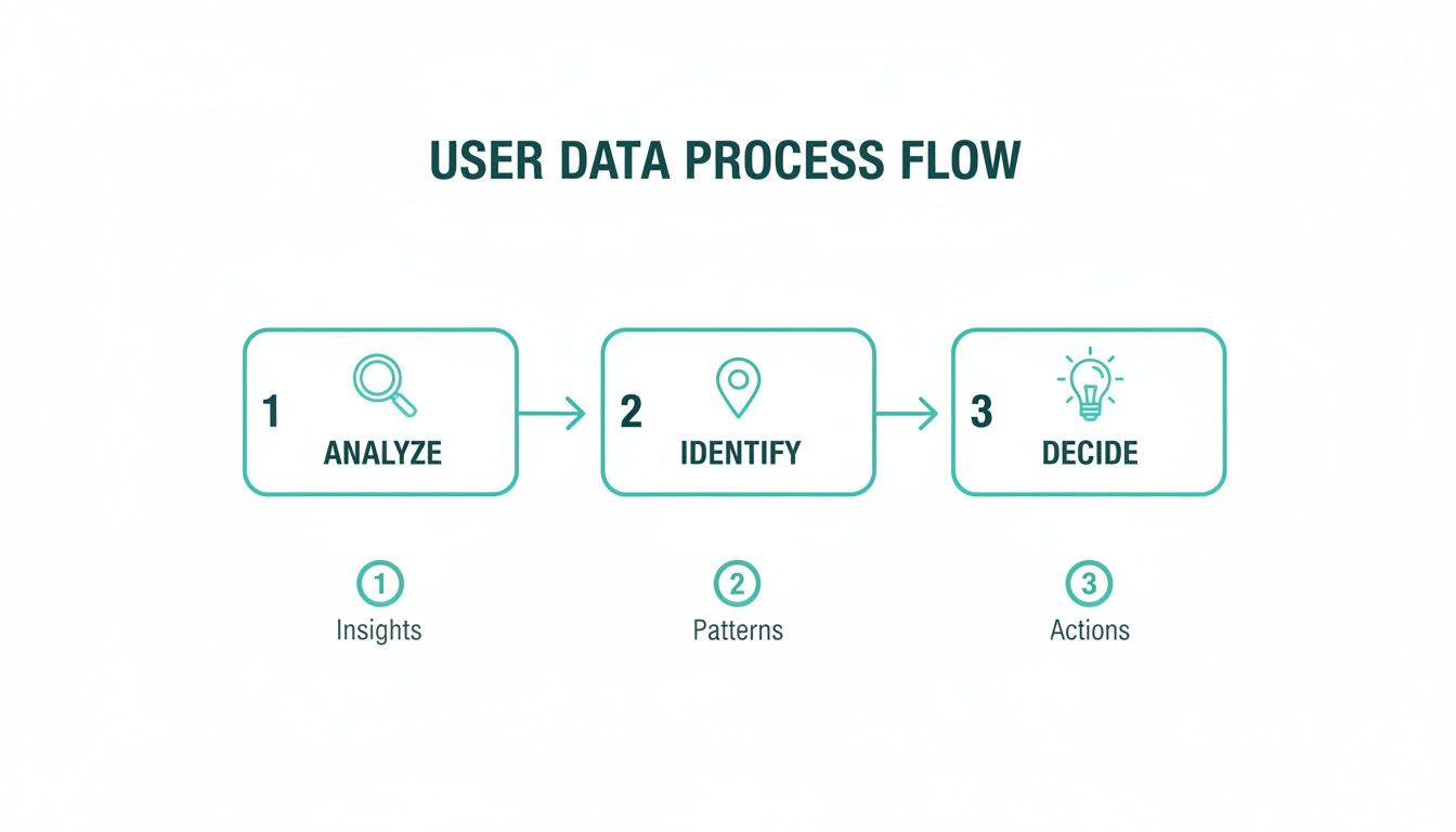
This simple flow is the heart of CRO. It’s a constant cycle of understanding what your users are doing, spotting where they're getting stuck, and then making a targeted change to help them along.
Craft a Value Proposition That Resonates
You’ve got about five seconds to make an impression. When a potential customer lands on your page, they need to know instantly what you do and why you’re the best choice for them. A generic, fluffy message just won’t cut it with a savvy Aussie audience.
Your pitch needs to be sharp, clear, and relevant.
- Be Specific: Instead of a vague "High-Quality Plumbing Services," get straight to the point. Try something like, "24/7 Emergency Plumbers in Adelaide's Eastern Suburbs. Fixed-Price Quotes, No Call-Out Fee." See the difference?
- Focus on Outcomes: Don't just list what you do; sell the benefit. Rather than "We use premium materials," frame it as "A durable roof that protects your home for decades, guaranteed." You're selling peace of mind, not just tiles.
- Use Local Language: Weave in terms and phrases that feel natural to Australians. It's a small touch, but it makes your brand feel familiar and instantly more trustworthy.
Essentially, you need to answer the visitor's unspoken question: "What's in it for me?" Get that right, and you’ve won the most important battle for their attention.
Build Unshakeable Trust and Authority
Trust is the currency of the internet. Before anyone gives you their details—let alone their money—they need to feel 100% confident in your business. This is non-negotiable for service providers, where expertise and reliability are everything.
People buy from businesses they trust. Displaying genuine social proof isn't just a nice-to-have; it's a fundamental part of demonstrating your credibility and reassuring potential customers they're making the right choice.
Here are a few powerful ways to build that trust on your site:
- Showcase Local Testimonials: Get reviews from real Aussie customers and mention their suburb or city if they're comfortable with it. A glowing review from "Sarah in Brisbane" feels far more genuine and relatable than one from an anonymous user.
- Display Industry Accreditations: Are you a Master Builder, a CPA-certified accountant, or a licensed electrician? Get those logos on your site, front and centre. They are instant visual signals of your professionalism.
- Introduce Your Team: Especially for service businesses, putting a face to the name works wonders. A simple "About Us" page with professional photos and short bios of your key people makes your business feel human and much more approachable.
Optimise Forms and Calls to Action
Your call-to-action (CTA) button and the form behind it are the final hurdles. This is precisely where so many businesses lose conversions due to simple, avoidable mistakes. Every element here needs to be crystal clear and effortless, especially on mobile where people have zero patience.
Just look at the numbers. The Australian services sector is actually outperforming e-commerce averages with a solid 3.3% conversion rate. This tells us that service businesses have a massive opportunity if they can just nail their lead capture process.
Here are some quick wins for your CTAs and forms:
- Use Action-Oriented Text: Ditch the boring "Submit" button. Use value-driven phrases that tell the user what they're getting, like "Get My Free Quote Now" or "Download Your Guide."
- Make Buttons Stand Out: Use a bold, contrasting colour for your CTA button so it pops off the page. It should be impossible to miss.
- Keep Forms Short: Seriously, only ask for what you absolutely need. Every extra field you add is another reason for someone to give up. For an initial quote, a name, email, phone number, and a brief message is usually plenty.
Streamline the E-commerce Checkout
For online stores, the checkout is the moment of truth. Cart abandonment is a killer, and it's usually caused by unexpected costs or a clunky, confusing process. Your only goal here is to make buying from you as fast and painless as possible.
Top Checkout Optimisation Tips for Aussie Stores:
| Tactic | Why It Works in Australia |
|---|---|
| Offer Local Payment Options | Integrating Afterpay, Zip, and PayPal is non-negotiable. Many Australian shoppers expect these "buy now, pay later" options and will bounce if they aren't there. |
| Be Transparent with Shipping | Clearly display shipping costs and estimated delivery times (e.g., metro vs. regional) before the final step. Surprise fees are the #1 conversion killer. |
| Enable Guest Checkout | Don't force people to create an account. It’s a huge barrier. Let them check out as a guest and offer the option to create an account after they've paid. |
At the end of the day, a fantastic user experience underpins every high-converting page. Our guide on user experience design principles covers more of the fundamentals. But to truly see what's working and what isn't, exploring a few practical web usability testing techniques is one of the best ways to find your next big win.
How to Run Simple A/B Tests for Big Wins
The term "A/B testing" can sound a bit technical and intimidating, but honestly, it's one of the most powerful and straightforward tools you can have in your CRO kit. Think of it as a simple experiment. You're just showing half your website visitors one version of a page (Version A) and the other half a slightly different one (Version B). Then, you sit back and see which one gets more customers to take action.
That's it. It's a direct, no-nonsense way to let your customers tell you what they actually prefer, using hard data instead of relying on a gut feeling or what you think looks best.
By running a series of these small, controlled tests, you can methodically chip away at the friction on your site and improve its performance over time. This is the engine that drives real, sustainable growth for so many Aussie businesses. The trick is to start small and focus on the things that will actually move the needle. You don't need a full-site redesign; you just need to test one change at a time so you know for sure what's working.
Start with a Strong Hypothesis
Every A/B test that's worth running starts with a strong hypothesis. This isn't just a random idea you plucked out of thin air. It's an educated guess based on what you've already learned from your data, whether that's from Google Analytics, heatmaps, or even customer feedback.
A good hypothesis usually follows this simple formula: "I believe that changing [X] into [Y] will [achieve a specific outcome] because [reasoning]."
This structure forces you to be strategic. It connects a change you want to make directly to a business goal and makes you justify why you think it will work.
Here are a few real-world examples for Australian businesses:
- For a local tradie: "I believe changing the call-to-action button from ‘Learn More’ to ‘Get My Free Quote’ will increase form submissions because it’s far more specific and matches what someone looking for a plumber actually wants."
- For an e-commerce store: "I believe adding Afterpay and Zip logos right next to the ‘Add to Cart’ button will reduce cart abandonment, as it immediately tells budget-conscious Aussie shoppers they have flexible payment options."
- For a professional service: "I believe replacing a generic stock photo on the homepage with a photo of our actual team will increase booked consultations because it builds instant trust and makes our firm seem more approachable."
See how each of these is clear, testable, and based on a genuine insight into customer behaviour? That's the goal.
Choosing Your A/B Testing Tool
You absolutely do not need a massive budget or a team of developers to get started here. There are plenty of user-friendly tools out there that make setting up and running these experiments incredibly simple.
Many modern platforms have visual editors that let you make changes to your website without touching a single line of code. You can easily change text, swap images, or alter button colours with a few clicks. These tools handle all the technical heavy lifting, like splitting your traffic and tracking the results for you. For most Australian SMBs, the easiest path is often a tool that integrates directly with your existing website platform.
The goal isn't to find the most complex tool; it's to find one that allows you to consistently test your ideas. A simple tool used regularly is far more valuable than a powerful one that gathers dust.
A Practical Scenario: A Plumber in Adelaide
Let's imagine a plumber in Adelaide wants more leads from their website. They look at their Google Analytics and see plenty of traffic hitting their main landing page, but very few people are actually filling out the quote request form. Their hypothesis is that their current headline, "Reliable Plumbing Services," is just too generic and boring.
They decide to run a simple A/B test.
- Version A (The Control): This is the original page with the headline, "Reliable Plumbing Services."
- Version B (The Variation): This version has a new, benefit-focused headline: "Adelaide's Blocked Drain Specialists – Fixed in 60 Mins."
Using an A/B testing tool, they set the test to run for two weeks. The tool will automatically show half of all new visitors Version A and the other half Version B. It then tracks how many people from each group go on to click "Request a Quote" and submit the form.
After two weeks, the results are in. Version B, with its specific and compelling headline, led to a 27% increase in completed quote forms. They now have statistical proof that the new headline works better. They can confidently switch Version B to be the new permanent headline for everyone and start thinking about what to test next.
What to Test for Maximum Impact
When you're just starting out, it's crucial to focus on the elements that have the biggest influence on a visitor's first impression. We're talking about the "above the fold" components—the things people see without having to scroll.
Here are a few high-impact elements to consider for your first round of tests:
- Your Main Headline: This is the first thing almost everyone reads. Make it count.
- Your Hero Image or Video: The main visual on your page sets the tone.
- Call-to-Action (CTA) Button: Test the text, colour, and even the placement.
- Forms: Try reducing the number of fields or changing the labels to be clearer.
- Social Proof: Experiment with the placement and type of testimonials or reviews you display.
By testing these core elements one by one, you’ll start to see those small wins accumulate. Over time, they add up to a significant lift in your overall conversion rate. This continuous process of testing, learning, and improving is the very essence of effective conversion rate optimisation in Australia.
Connecting CRO with Your Google Ads Strategy

Driving paid traffic from Google Ads to a website that isn’t ready for it is one of the fastest ways to burn through your marketing budget. It’s like inviting hundreds of people to a grand opening but forgetting to unlock the front door. You’re paying for every single click, but if the destination doesn’t deliver, those potential customers are gone in an instant.
This is exactly why your CRO efforts and your Google Ads strategy can't operate in separate silos. They need to be perfectly in sync.
When you align the promise in your ad with the experience on your landing page, you create a seamless journey that makes it easy for a visitor to say "yes." This integrated approach ensures every dollar you spend on ads is working as hard as possible to bring you valuable customers.
The Power of Message Match
One of the most crucial concepts linking your ads and landing pages is message match. It’s a simple but incredibly powerful idea: the headline and core message of your ad should be mirrored almost exactly on the page the user lands on after clicking.
Think about it from a customer's perspective. When someone in Melbourne searches for "emergency plumber" and clicks an ad promising "24/7 Service, No Call-Out Fee," they expect to see those exact words front and centre on the landing page.
If they land on a generic homepage that just says "Plumbing Services," you’ve created a moment of confusion. This tiny bit of friction is often all it takes for them to hit the back button and click on your competitor’s ad instead.
A strong message match is an instant confirmation for the user. It tells them, "Yes, you're in the right place, and we have exactly what you were looking for." This immediate reassurance is the cornerstone of any high-converting paid traffic campaign.
Dedicated Landing Pages Are Non-Negotiable
This leads us to the next critical point: you should almost never send paid ad traffic to your homepage. Instead, you need to create dedicated landing pages for each of your specific ad groups.
If you have one campaign targeting "blocked drains" and another for "hot water system repairs," each one needs its own unique landing page, laser-focused on that specific service. This allows you to perfect your message match and speak directly to the user’s immediate pain point.
- For a "Blocked Drains" Ad Group: The landing page headline should be something like "Blocked Drain Experts in Adelaide." The copy needs to focus on fast response times and fixed-price solutions for that specific problem.
- For a "Hot Water Systems" Ad Group: Here, the headline could be "Hot Water System Repair & Replacement." The page content should highlight your expertise with different brands and your installation guarantees.
This level of specificity dramatically improves relevance. Not only does this boost your Google Ads Quality Score (which can lead to lower ad costs), but more importantly, it skyrockets your conversion rate.
Using A/B Test Insights to Refine Your Ads
The relationship between CRO and Google Ads is a two-way street. The insights you get from your A/B tests are pure gold for refining your ad copy and targeting. Your tests reveal the exact words, phrases, and value propositions that truly resonate with your Australian audience.
Imagine you A/B test two different guarantees on your landing page: "100% Satisfaction Guarantee" versus "5-Year Workmanship Warranty." If the warranty version wins by a landslide, that’s a clear signal from the market. You should immediately start weaving that winning phrase into your ad headlines and descriptions.
The results from a well-structured conversion rate optimisation Australia program create a powerful feedback loop. Your website tests tell you what convinces people to convert, and you then use that proven messaging to attract more of the right people from your ads. This is where truly impressive growth happens.
Expert agencies across Australia are seeing this firsthand. Many report an average 34% increase in conversion rates across campaigns simply by using deep audits to find these optimisation opportunities. You can get more insights on how Australian agencies are succeeding with CRO.
Your Top CRO Questions Answered
Diving into conversion rate optimisation always sparks a few questions. How much is this going to cost? When will I actually see a result? Can I even do this myself? Let's get straight into the honest answers we give our Australian clients every day.
How Much Does CRO Cost in Australia?
The truth is, the cost of CRO in Australia can be anything from a few hundred dollars a month to several thousand. You could start out on your own with free tools like Google Analytics and a small subscription for a testing tool, or you could go all-in with a dedicated agency.
But here’s the thing: it’s better to think of it as an investment, not a cost. Good CRO directly boosts the revenue you make from the website traffic you’re already paying for. A clever strategy always starts with the high-impact, low-effort changes first. This way, the new leads and sales you generate will quickly cover the initial spend and then some.
How Long Until I See Results From CRO?
You might see a tiny bump overnight from a quick fix, like making your phone number a 'click-to-call' link. But for real, meaningful improvements, you should expect to see results within 2-3 months.
That timeframe isn't a guess; it's a realistic window. It gives you enough time to gather solid data, run a proper A/B test (which often needs 2-4 weeks to be statistically valid), and then figure out what to do next based on what you’ve learned. CRO isn’t a one-off task, it’s a continuous cycle of improvement. Patience is key—you have to let the data lead the way to get that serious, long-term growth.
The goal of CRO isn't just about chasing a quick win. It's about building a system of continuous improvement that becomes a powerful, revenue-generating engine for your business.
What’s a Good Conversion Rate for a Service Business?
Everyone asks this, but "good" is entirely relative to your own business and industry. Sure, the average for Australian service businesses sits around 3.3%, but we've seen personal services hit over 8%.
Instead of getting hung up on an industry benchmark, focus on one thing: beating your own current conversion rate.
If your site is converting at 1.5% right now, getting it to 3% is a massive win. You've just doubled the number of leads you're getting from the exact same marketing budget. That's where the real power is.
Can I Do CRO Myself, or Do I Need an Agency?
You can absolutely get started on your own. Following the advice in guides like this and using some of the more user-friendly tools is a fantastic way to dip your toes in the water and understand the fundamentals. To get a broader understanding of the core principles, checking out various Conversion Rate Optimization Techniques is a great place to start.
However, bringing in a specialist agency gives you access to a level of experience, powerful software, and dedicated time that most business owners just don't have. A seasoned team can fast-track your results, steer you clear of common mistakes, and weave CRO into your other marketing efforts to turn those small initial wins into significant, business-changing growth.
At Frank Digital Agency, we specialise in turning your existing website traffic into tangible revenue. If you're ready to stop guessing and start making data-driven decisions that grow your bottom line, let's talk. Contact us today for a no-obligation strategy session and discover the hidden potential in your website.