
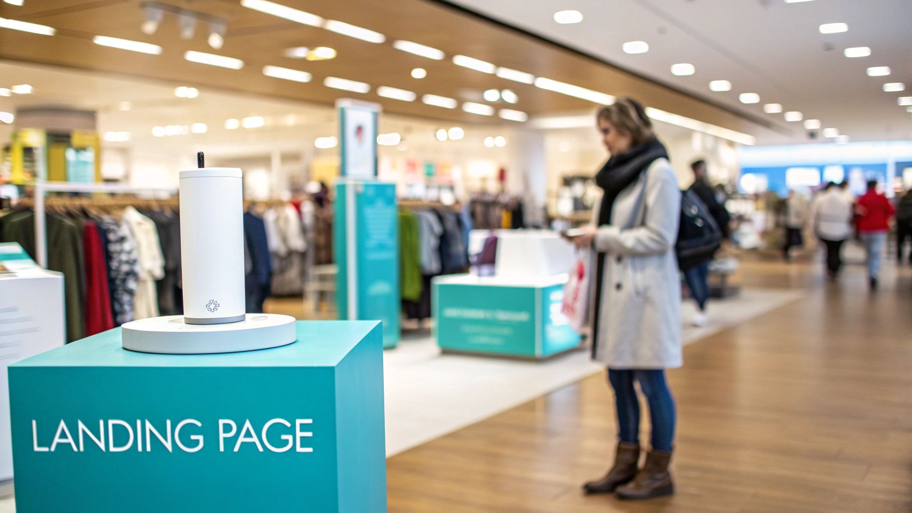
Think of your website's homepage as the main entrance to a bustling department store. It’s designed for browsing, with countless aisles and displays to explore. A landing page, on the other hand, is more like a dedicated pop-up shop inside that store—it has one product, one message, and one clear purpose.
In simple terms, a landing page is a standalone web page built specifically for a marketing or advertising campaign. It’s where a visitor "lands" after they click on an ad, an email link, or a social media post.
What's the Real Point of a Landing Page?
The entire reason a landing page exists is to drive conversion. That’s it. Unlike your homepage, which is designed to welcome everyone and show them around, a landing page is all business. It's built for a single, focused action.
To achieve this, we strip away all the usual distractions. You won't find a navigation menu, extra sidebars, or a footer full of links. Every element on the page works together to guide the visitor toward one specific goal, whether that's filling out a form, downloading a guide, or making a purchase.
This laser focus is its superpower. It channels all the user's attention towards a single call-to-action (CTA), creating a direct path from interest to action. It's also a fantastic way to test new ideas; you can create a simple landing page to validate an idea long before you commit to building out a full product or service.
Homepage vs Landing Page at a Glance
To really hammer home the difference, let’s put them side-by-side. While both are crucial parts of your online presence, they play completely different roles. One is for browsing and brand discovery, while the other is purely for decision-making.
This table gives a quick rundown of their fundamental differences.
| Feature | Homepage | Landing Page |
|---|---|---|
| Primary Goal | Encourage exploration and brand discovery. | Drive a single, specific conversion action. |
| Navigation | Full navigation menu with many links. | No navigation links to other site pages. |
| Content | Broad overview of the company and services. | Highly focused on one offer or message. |
| Traffic Source | Diverse (direct, organic, referral). | Specific campaigns (ads, email, social). |
| Call-to-Action | Multiple, varied CTAs (e.g., "Learn More," "Contact Us"). | One primary, clear call-to-action. |
As you can see, they are built for entirely different jobs. This focused approach is why landing pages work so well.
Why Your Business Can't Afford to Ignore Landing Pages
At the end of the day, a landing page is a powerful tool for maximising your marketing return on investment (ROI). By creating a unique page for each campaign, you can perfectly match your message to what your audience is looking for, which naturally leads to better engagement and, most importantly, more conversions.
A great landing page provides a clear, frictionless path for your potential customers. It answers their immediate question, reinforces the value promised in your ad, and makes it incredibly easy for them to take the next step.
Think about it: sending expensive, hard-won traffic from an ad campaign to your general homepage is a recipe for disaster. Your core message gets lost in the noise, visitors get confused, and your ad spend goes down the drain.
A well-crafted landing page ensures every click has the best possible chance of turning into a lead or a customer. It's not just a "nice-to-have"—it's an essential part of any successful digital marketing strategy.
The Anatomy of a High-Converting Landing Page
To really get what makes a landing page work, you have to break it down into its core parts. I like to think of it as a high-performance engine. Every single component has a specific job, and they all need to work together flawlessly to generate power. A high-converting landing page is no different.
Each piece is strategically placed to guide a visitor from the moment they arrive to the moment they take action. Let's pull this thing apart, piece by piece.
The Attention-Grabbing Headline
Your headline is the very first thing a visitor sees, and it’s often the deciding factor in whether they stick around or hit the back button. It has one job: to instantly answer the visitor’s silent question, "Am I in the right place?"
A powerful headline has to be clear, concise, and match the promise you made in the ad or link they just clicked. This isn't the place for clever puns or vague marketing speak; it’s all about crystal-clear communication. A great headline connects their problem to your solution in a single, punchy statement.
So, instead of something generic like "Innovative Plumbing Solutions," a much better headline would be "Fast, Reliable Hot Water System Repairs in Adelaide." See the difference?
Compelling Copy and a Strong Offer
Okay, the headline grabbed their attention. Now the rest of your copy needs to hold it. This is your chance to really connect with the visitor. This isn't about listing your company’s features; it’s about clearly explaining the benefits for the person reading.
I always recommend using short paragraphs and bullet points. It makes the text scannable and easy to digest.
Your copy should focus on a simple narrative:
- The Problem: Show them you understand the pain point they're dealing with.
- The Solution: Clearly explain how your product or service fixes that exact problem.
- The Outcome: Paint a picture of the positive result or transformation they'll experience.
This benefit-first approach makes your offer feel like a must-have, not just a nice-to-have. For local businesses, this is where you prove you get your customers.
Visuals and Social Proof
It’s an old saying, but it’s true: people process images way faster than text. A great hero shot—a high-quality image or video showing your service or product in action—can create an instant emotional connection. It helps visitors see themselves getting the benefit you’re offering.
Right after the visuals, you need to build trust. This is where social proof comes in.
Social proof is really just the modern version of word-of-mouth. It works because of a simple psychological trigger: we're more likely to do something if we see that other people have already done it and had a good experience.
You can add social proof in a few different ways:
- Customer testimonials (with names and photos, if possible).
- Logos of well-known clients you’ve worked with.
- Case studies that show off specific, measurable results.
- Star ratings or reviews pulled from places like Google.
These elements go a long way in reducing any hesitation a visitor might feel, making it much easier for them to trust you. If you want to dig deeper into this, you can check out our guide on key web design elements that boost conversion rates.
The All-Important Call-to-Action
Finally, every single element on the page should point to one thing: the Call-to-Action (CTA). This is the button, the form, the big finale where the conversion actually happens. Your CTA needs to be unmissable.
Use a contrasting colour that makes it pop off the page. Critically, the text on the button should be action-focused and specific. Ditch the generic "Submit."
Instead, use phrases that reinforce the value, like "Get Your Free Quote Now" or "Download My Ebook." This specificity tells the user exactly what to expect when they click. When you combine all these essential parts, you create a focused, persuasive experience that effectively turns curious visitors into real leads and customers.
Common Types of Landing Pages and When to Use Them
Not all landing pages are created equal, and they shouldn't be. Think of your landing pages like specialised tools in a toolbox; you wouldn't use a hammer to turn a screw. The right type of page comes down to what you want to achieve with your campaign—are you trying to gather contacts for your sales team, or are you pushing for an immediate sale?
Knowing the main categories is the first step to picking the right tool for the job. While there are countless variations out there, most landing pages fall into two main camps: those built to capture information and those designed to warm up a visitor before they take the next step. Getting this choice right is absolutely critical to matching your page to your marketing goals.
Lead Generation Landing Pages
This is probably the most common type of landing page you'll come across. A lead generation landing page, or a "lead gen" page as it's often called, has one job and one job only: to capture a visitor's details, like their name, email, and phone number.
The dead giveaway is the web form. In return for filling it out, the visitor gets something valuable—what we in the business call a lead magnet. This could be anything from a free e-book or webinar signup to a custom quote for a service. The entire page is laser-focused on convincing the visitor that your offer is worth handing over their contact information for.
These pages are the real workhorses for businesses that need to nurture prospects over time.
- When to Use Them: Perfect for service-based businesses in Adelaide, like tradies or professional services firms, that want to build a solid list of potential clients.
- Example Goal: To collect email addresses for a monthly newsletter or to get people to book a free consultation.
Click-Through Landing Pages
Unlike its lead-gen cousin, a click-through landing page doesn't have a form. Its purpose is much simpler: it acts as a bridge, a kind of "warm-up" between your ad and the final destination, which is usually a shopping cart or a more complex product page.
Picture this: you're selling a product with a few moving parts. If you send someone from a simple social media ad straight to a busy checkout page, it can be a bit of a shock to the system and cause them to bail. A click-through page smooths over this transition by providing just enough compelling info—key benefits, glowing testimonials, a quick product video—to build their confidence and get them excited enough to click the single call-to-action button.
A click-through page isn't selling the product; it's "selling the click." Its sole mission is to build desire and squash any hesitation before you ask for the final commitment.
This chart breaks down the main jobs of the most common landing page types.
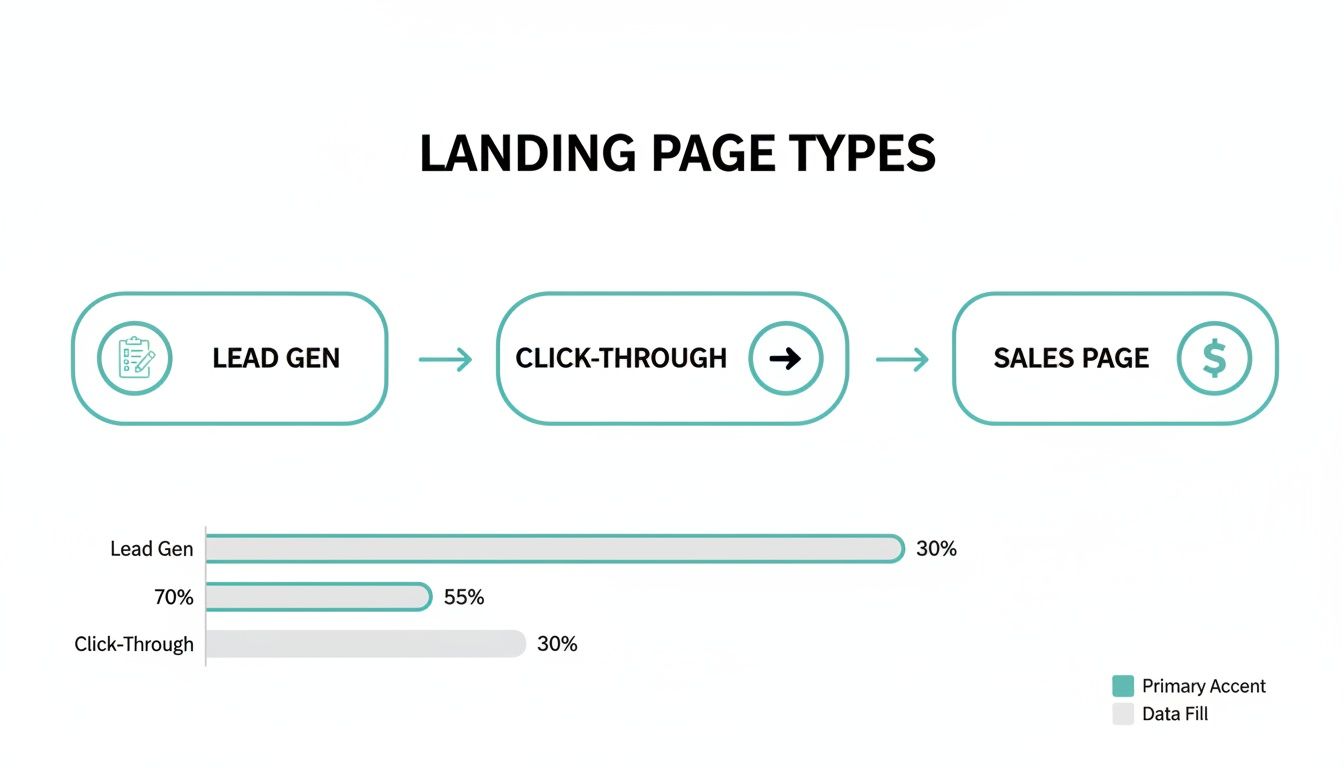
As you can see, each page is built around a specific action you want the user to take, whether that’s filling in their details or simply clicking through to the next step.
Other Important Variations
While lead gen and click-through pages will cover most of your bases, there are a couple of other types worth knowing about. A sales page is typically a much longer, more detailed page designed to persuade someone to buy right then and there. It pulls out all the stops with detailed copy, social proof, and a strong sense of urgency to close the deal on the spot.
On the other end of the spectrum is a splash page. This is a super simple, introductory page a visitor might see before entering your main website, often used for things like announcing a big promotion or verifying a user's age. Once you really understand a landing page's specific goal, you can choose the right format and structure it to get the best possible results.
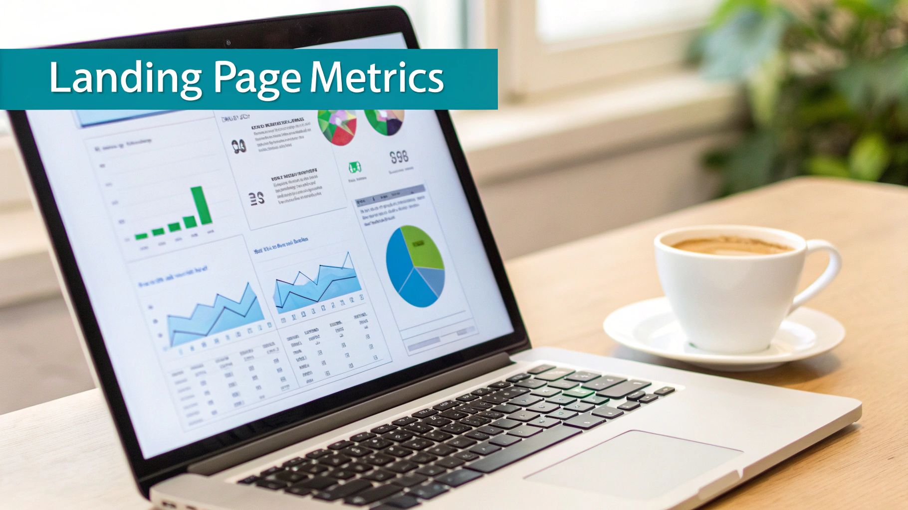
Essential Metrics for Measuring Landing Page Success
So, you've built a landing page. How do you know if it's actually doing its job? Launching the page is just step one; the real work begins when you start digging into the numbers. Shifting from guesswork to data-driven decisions is what separates a good landing page from a truly great one. You need to keep a close eye on a few key performance indicators (KPIs) to figure out what’s working, what’s falling flat, and where you can make improvements.
This numbers-first approach is all about making smart, informed decisions to constantly refine your pages and get better results. Let's get into the essential metrics that will give you a clear picture of your page's health.
The Most Important Metric: Conversion Rate
If you only have time to track one thing, make it this. Your conversion rate is simply the percentage of visitors who do what you asked them to do. It’s the ultimate report card for your landing page and the clearest signal of success.
The calculation is straightforward: divide the number of conversions by the total number of visitors, then multiply by 100. For instance, if 100 people land on your page and 5 of them fill out your form, your conversion rate is a neat 5%.
But what’s a "good" conversion rate? That really depends on your industry. To give you a bit of local context, we've put together a table showing typical conversion rates for Australian businesses.
Australian Landing Page Conversion Rates by Industry
This table shows the median conversion rates for various industries in Australia, helping businesses benchmark their performance against relevant competitors.
| Industry | Median Conversion Rate (%) |
|---|---|
| Finance & Insurance | 5.10% |
| Legal | 4.64% |
| SaaS | 3.00% |
| Health | 2.92% |
| Education | 2.88% |
| B2B Services | 2.58% |
| E-commerce | 1.84% |
Source: Data compiled from various industry reports for the Australian market.
As you can see, performance varies quite a bit. A law firm and an e-commerce store are playing in different leagues. For many of our local Adelaide clients, we recommend aiming for a 2-3% conversion rate as a solid starting point. Hitting 5% or more is a fantastic result, while anything under 2% is usually a sign that it’s time to start optimising.
Key Supporting Metrics to Watch
While conversion rate is the star of the show, a few other metrics provide crucial context. Think of them as the supporting cast—they help you understand the full story of what users are doing on your page and diagnose any problems.
Here are the other vital signs you should be monitoring:
- Bounce Rate: This is the percentage of people who hit your page and leave immediately without taking any action. A high bounce rate can mean there’s a mismatch between your ad and your landing page, or maybe your headline just isn't grabbing their attention.
- Time on Page: Sometimes called 'dwell time', this tells you how long visitors are sticking around. Longer times are generally a good sign—it means people are engaged with your content. A super short time on page can be a red flag.
- Cost Per Acquisition (CPA): If you're running paid ads, this one is non-negotiable. It tells you exactly how much you're spending to get one new customer or lead. Your goal isn't just to get conversions; it's to get them profitably.
- Form Submissions: For a lead generation page, this is as simple as it sounds: a direct count of how many people successfully submitted your form.
By tracking these KPIs together, you can piece together the story of your landing page's performance.
For example, a low conversion rate combined with a high bounce rate and low time on page is a massive clue that your core message isn't connecting. Armed with that knowledge, you can start making targeted changes to fix it.
This whole process is part of a wider strategy called Conversion Rate Optimisation (CRO). To see how this can completely change your results, check out our deep dive into conversion rate optimisation in marketing.
How to Align Your Landing Page with Your Traffic Source
Picture this: you're meeting someone for the first time. The way you'd chat with someone introduced by a close friend is completely different from how you'd talk to a stranger at a big networking event, right? The context changes everything. It’s the exact same idea with your landing page. Someone arriving from a targeted email has a totally different mindset than someone who just clicked a broad ad on social media.
This vital concept is called message match. It's all about making sure the journey from the ad or link to your page feels smooth and logical. When the headline, images, and offer on your landing page perfectly mirror what was promised in the ad, you instantly build trust. It’s like a quiet nod to the visitor, saying, "Yep, you've come to the right place."
Tailoring Your Page for Different Channels
If you don't align your page with where your traffic is coming from, you're practically waving goodbye to potential customers. Let’s break down how to get this right for the most common marketing channels.
For a Google Ads campaign, your landing page headline needs to be a direct echo of what the user searched for. If they typed in "emergency plumber Adelaide," your page better greet them with something like "Adelaide's Trusted 24/7 Emergency Plumber." That immediate alignment confirms you have the solution they’re desperately looking for.
Social media ads on platforms like Facebook are a different beast. People are usually scrolling and exploring, not actively searching. Here, your landing page needs to be more visual and lean into the emotional side of your offer, continuing the story you started in your ad. If you're curious about the strategic differences, our guide comparing Google Ads vs Facebook Ads is a great read.
Message match isn't just a "nice-to-have" — it’s a fundamental way of respecting your visitor's time and attention. It reassures them their click was worthwhile, making them far more likely to stick around and convert.
Why Your Traffic Source Dictates Performance
Where a visitor comes from tells you a lot about their mindset and how ready they are to take action. People from different channels are at different stages of their buying journey, and knowing this is crucial for understanding your conversion rates.
Take someone who clicks a link in your email newsletter. They already know who you are; they’re a warm lead. That existing trust means they’re much more open to what you have to offer.
Recent Australian benchmark data really drives this point home. Landing pages fed by email traffic convert at a brilliant 12.8%. That’s almost double the rate from paid search, which sits at 7.2%. This data, highlighted in these Australian conversion benchmarks on Unbounce.com, clearly shows that an audience you've already nurtured is primed to convert.
By creating separate landing pages for each main traffic source—one for email, one for Google Ads, one for social media—you can speak directly to each group's unique expectations. This tailored strategy is the secret to building high-converting landing pages that actually grow your business.
How We Build Landing Pages That Drive Results
Knowing what a landing page is and understanding all the right components is one thing. Actually building one that consistently turns clicks into real customers for a local business? That’s a whole different ball game.
Here at Frank Digital Agency, we don’t just assemble pages; we engineer conversion machines. It’s all built on a proven, data-driven process that we’ve refined over years of helping businesses just like yours.
It all kicks off with a simple, yet crucial, first step: we listen. Before we even think about design, we dive deep into your business. We get to grips with your specific goals, who your ideal Adelaide customers are, and what makes your offer stand out from the crowd. This groundwork ensures every decision we make is aimed squarely at delivering tangible results.
Strategy Before Design
Let’s be honest, a pretty page that doesn’t convert is just a pretty waste of money. That's why our process always starts with solid strategy and killer copy. We zero in on the benefits, not just the features. Instead of listing what your service is, we show visitors how it solves their specific problem and genuinely improves their life.
We craft a powerful value proposition that speaks directly to your audience. Every headline, every bullet point, and every call-to-action is meticulously written to guide the user smoothly towards that conversion goal. To do this right, you need to know how to create a landing page that performs great from the very start, and nailing the copy is a huge piece of that puzzle.
This user-first approach flows directly into our design philosophy.
Conversion-Focused Design and User Experience
Once we've locked in the core message, we translate that strategy into a design that’s both intuitive and persuasive. Our approach is all about clarity and simplicity. We ruthlessly strip away any distraction that could tempt a visitor away from the main goal.
We prioritise a clean layout, a strong visual hierarchy, and a mobile-first approach. With so many local searches happening on smartphones, making sure your page looks and works flawlessly on a smaller screen isn't just a nice-to-have; it's essential.
Our design process focuses on:
- Intuitive Layout: We guide the user's eye naturally down the page, leading them right to the call-to-action.
- Compelling Visuals: We use high-quality images and videos that not only support the copy but also forge an emotional connection.
- Trust Signals: Testimonials, customer reviews, and industry badges are strategically placed to build credibility and ease any hesitation.
We believe that great design isn't about how it looks; it's about how it works. A landing page's success is measured by one thing: its ability to persuade a visitor to take a specific, desired action.
A Commitment to Data and Continuous Improvement
Launching your landing page is just the beginning. The digital space is always shifting, and what works brilliantly today might be improved upon tomorrow. We are unapologetically data-driven, using analytics and A/B testing to fine-tune every element of your page for peak performance.
We keep a close eye on key metrics like conversion rates, bounce rates, and cost per lead. By systematically testing different headlines, button colours, or copy variations, we let the data show us what truly resonates with your audience.
This cycle of continuous optimisation means your landing page isn't just a static asset. It's a powerful, ROI-focused tool that evolves and adapts to deliver better and better results over time.
Got Questions About Landing Pages? We've Got Answers.
When you start digging into landing pages, it's totally normal to have a few questions. This is a seriously powerful marketing tool, and getting the details right can make a world of difference to your results. To help you out, we’ve put together answers to the most common questions we hear from local business owners just like you.
Think of this as your quick-start guide to the essentials. No fluff, just practical info to help you move forward.
How Many Landing Pages Do I Actually Need?
There’s no magic number here. The simple answer is this: you need one for every distinct campaign you run. A good rule of thumb is to create a unique landing page for each specific offer, audience, or traffic source.
Let's say you're a plumber in Adelaide. You wouldn't want to send people searching for "Hot Water System Repairs" to the same page as those searching for "Blocked Drain Services," right? Each service needs its own dedicated page to match the ad perfectly.
The data doesn't lie: having more landing pages leads directly to more business. In fact, businesses with 30 or more landing pages generate a staggering 7 times more leads than companies with fewer than 10. That might sound like a lot, but you can start small. Just create a dedicated page for each of your main services and promotions, and build from there.
What’s the Secret to a Good Headline?
A killer headline is clear, straight to the point, and screams "benefit!" It has to immediately tell your visitor, "Yep, you're in the right place." Ditch the clever, cutesy wordplay for absolute clarity. Your headline must be a direct echo of the promise you made in the ad they just clicked.
A simple formula that works wonders is:
- Start with an action verb: Think "Get," "Fix," or "Download."
- State the specific benefit: What’s the incredible outcome they'll get?
- Add a timeframe or location (if it helps): Words like "in 24 Hours" or "in Adelaide" add urgency and local flavour.
So, a great headline might be: "Get a Fast, Free Quote for Your Adelaide Bathroom Renovation." It's direct, benefit-driven, and tells the user exactly what to expect.
Your headline is your first impression. You get about three seconds to convince a visitor they've found what they're looking for. Make it count.
Can't I Just Use My Homepage as a Landing Page?
You could, but it's one of the biggest marketing mistakes you can make. Your homepage is built for browsing. It’s like a department store directory, full of links, different sections, and multiple messages, all inviting people to wander around.
A landing page, on the other hand, is built for one thing: action. By stripping away all the navigation and other distractions, you create a single, focused pathway for your visitor to follow. This massively increases the odds they'll do the one thing you want them to do. Sending paid ad traffic to your busy homepage is like throwing money away—it almost always kills your conversion rates.
How Long Should My Landing Page Be?
It all comes down to how much your visitor has to think about your offer.
For a simple, low-risk action like grabbing a free guide, a short and punchy page is all you need. But for a bigger decision, like booking a high-end service, you'll need a longer page. This gives you the space to add more detail, customer testimonials, and answer common questions to build trust and squash any doubts.
The goal is to give just enough information to persuade someone to act, and not a word more. Always choose clarity over length.
Ready to turn those clicks into actual customers for your Adelaide business? The team at Frank Digital Agency lives and breathes this stuff. We build high-converting landing pages that are all about getting you a solid return on your investment. Let's get you the results you've been looking for. Find out more at https://frankdigital.agency.